
 If you've found the material on this site useful, please consider purchasing this
e-book (only $10), which is based on the Python material in the tutorial. Doing so helps me
maintain and update this site. Thank you very much!
If you've found the material on this site useful, please consider purchasing this
e-book (only $10), which is based on the Python material in the tutorial. Doing so helps me
maintain and update this site. Thank you very much!

@markroseman
mark@markroseman.com
 Buy now for your Kindle
 Buy the DRM-free PDF
Essentials
- Tk Backgrounder
- Installing Tk
- Tutorial
- Widget Roundup
- Languages Using Tk
- Official Tk Command Reference
(Tcl-oriented; at www.tcl.tk)
Tutorial
Case Study: IDLE Modernization
This chapter presents a case study of modernizing the appearance of a substantial Tk-based application.
This chapter is currently (November 2015) a work in progress. The code here is slowly finding its way into the Python source tree, but most is not there yet. You can find temporary snapshots on GitHub.
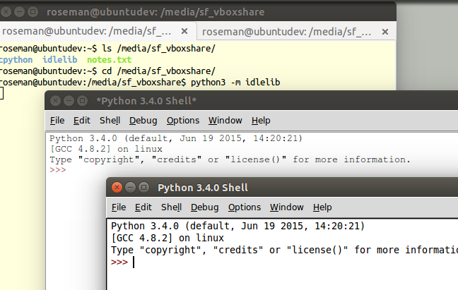
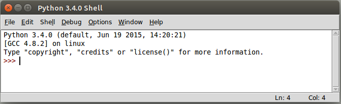
IDLE (Integrated DeveLopment Environment) is the standard Python development environment that is bundled with every Python release. It consists of an interactive Python shell, editors with syntax highlighting, a debugger, etc. Its user interface is written in Tkinter.
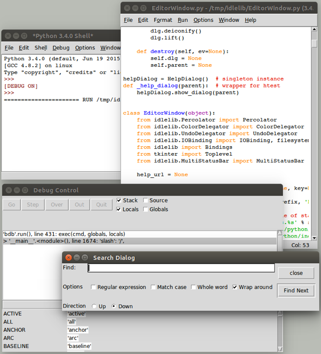
Overview of IDLE user interface (on Linux)
IDLE was never intended to be a replacement for more full-featured development environments. Because it is relatively simple and integrated, and because it is bundled with Python, it is popular for those learning (and teaching) the language.
Originally created by Python BDFL Guido van Rossum in 1998, IDLE has been incrementally added to over the years by multiple other developers. But with limited development effort spent on it, it was showing its age, especially on platforms (e.g. Mac OS X) infrequently used by those improving IDLE.
A Python Central comparison of IDE's described IDLE this way:
All those features are in fact present, but they do not really make an IDE. In fact, while IDLE offers some of the features you expect from an IDE, it does so without even being a satisfactory text editor. The interface is buggy and fails to take into account how Python works, especially in the interactive shell, the auto-completion is useless outside the standard library, and the editing functionality is so limited that no serious Python programmer — heck, no serious typist — could use it full-time.
If you use an IDE, it should not be IDLE.
With its buggy and dated user interface, IDLE was at some risk of being removed from the Python distribution altogether. Yet, because of the relative simplicity and it being bundled, there were a number of people, particularly those teaching Python, eager to see IDLE leap forward.
IDLE was obviously a great candidate to be modernized, using newer Tk features like the themed widgets to help spur some redesign. But it was about more than just swapping widgets. Many improvements could be made just by changing how the "classic" widgets were being used, to better reflect a more modern design aesthetic.
Because IDLE, which is an application, was a part of Python's standard library (i.e. 99% designed to be used by other code), there were many policies and procedures not really appropriate for an application that made changes difficult. Removing some of those roadblocks (see PEP 434) was a significant step required for the types of changes being discussed here.
Project Goals
As you can imagine, modernizing a large application like this, based on "classic" Tkinter, was not entirely straightforward. In this chapter, I'll walk through some of the user interface changes that were made and why.
Everyone involved wanted to see IDLE look a lot better than it did, though nobody was under the illusion that it was going to turn into a stunning example of cutting-edge design. But something that fit in more, so that people could learn about Python without getting distracted by the clumsiness of their tools, seemed doable.
The goal also wasn't to try to compete with Python IDE's more commonly used by professional programmers, such as PyCharm, WingIDE, PyDev, Komodo, etc. Though some more experienced Python developers did use IDLE, either sporadically or regularly, it primarily needed to appeal to newcomers to the language, and often those new to programming altogether.
There have been no shortage of previous attempts to radically advance IDLE, resulting in a number of different forks that boasted all kinds of improvements. Many of them used other GUI toolkits or modules that weren't part of the standard library. It was important here to stay with Tkinter and the standard library, because we wanted to ensure every improvement could over time make it into the official version that ships with Python, rather than becoming just another fork.
As well, the hope was to make IDLE easier to contribute to. This suggested pruning down a substantial volume of code, removing some redundancies and inconsistencies, cleaning up some of the more complex pieces, simplifying interactions between system components, etc. There was also a fairly substantial list of reported bugs that we hoped to make a dent in.
While no less important, I'll largely defer discussion of the substantial issues surrounding software architecture, backwards compatibility (including for systems running Tk 8.4, pre-ttk, which received only a few selective improvements), etc.
Throughout this chapter, you'll find links to individual issues in Python's issue tracking system, which often provide additional insight into various peoples' thought processes around changes.
As you'll see, this chapter highlights many of the shortcomings of IDLE's user interface. This is done mainly for emphasis, because many of the problems shown here are common to many applications and user interfaces. I have only the highest respect for the people who donated their limited time and resources to this open source project, and had to consciously make tradeoffs between time, features, and user interface, all within the context of a decidedly non-trivial codebase.
As the material in this chapter relates to a specific Python application, all the examples will be given solely in Python and using Tkinter. So if you're wondering why you're seeing Python code here where you didn't everywhere else, that's why.
Menus
The very first change that was made was to remove the archaic tearoff menus [Issue#13884]. The Mac OS X version of Tk doesn't even support them, but they were still there on Windows and X11.
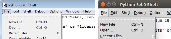
Tearoff menus on Windows and Linux
The change here was to add a "tearoff=0" option to the few places in the code where these menus were created.
At least that was easy.
There were also a number of bugs where items in the menu were not being properly disabled when the feature was not available, leading to either menu items that did nothing (confusing for learners), or error dialogs that said little more than "you can't do that".
Main Window
One good thing about IDLE is that, revolving around an editor and a shell, the majority of it really is a Tk text widget, and there was very little about its user interface that had to change. But even in the main window, which is mostly just a text widget, there were improvements to be had.
The following images show the original version of IDLE's shell window, pre-modernization, just as someone would see when they first launched the program.
Looking at them, what improvements would you make?
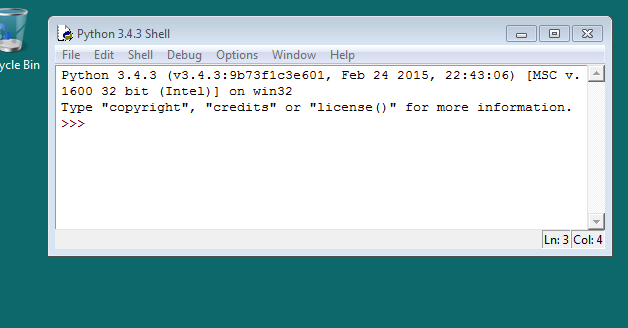
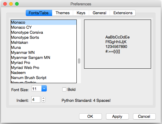
Main IDLE Window on Mac OS X
Main IDLE Window on Windows
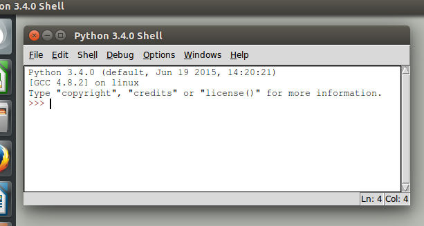
Main IDLE Window on Linux
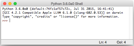
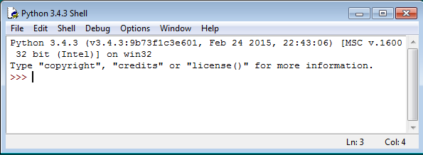
Default Font
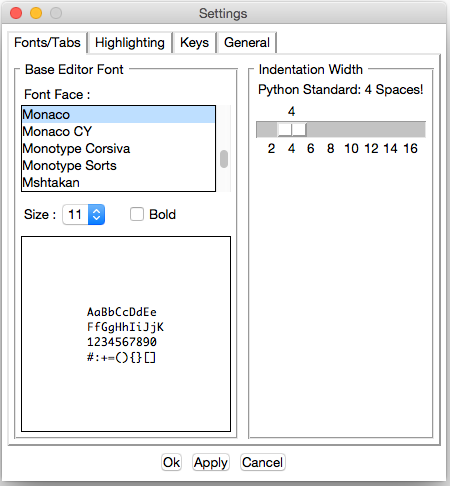
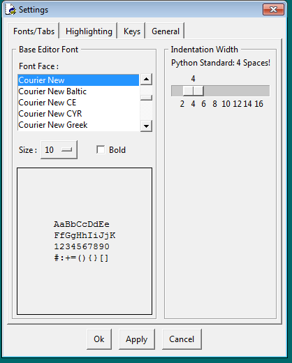
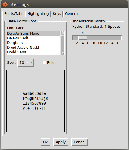
The first change that was made had to do with the default font. IDLE hardcoded 10 point Courier, and used that on all platforms. This didn't actually look too bad in Windows, was ok on Linux, but looked terrible on OS X [Issue#24745]. Sure this could be changed through a preferences dialog, but the defaults certainly didn't leave a good impression.
While one option would simply be to write the code to pick a good font depending on which platform we're running on, instead the default was changed to use Tk's built in "TkFixedFont", which provides a better default on each platform.
You can see the differences in the screen shots below. Notice how the new fonts seem to match better with system terminal windows that are shown.
IDLE Main Window using TkFixedFont (Mac OS X)
IDLE Main Window using TkFixedFont (Windows)
IDLE Main Window using TkFixedFont (Linux)
Speaking of preferences dialogs, if you want to change the font it often helps to know what the font actually is (using "Font.actual"). Here's the new code from IDLE's preferences dialog that figures that out:
        if (family == 'TkFixedFont'):
            f = Font(name = 'TkFixedFont', exists = True, root = root)
            actualFont = Font.actual(f)
            family = actualFont['family']
            size = actualFont['size']
            if size < 0:
                size = 10  # if font in pixels, ignore actual size
            bold = 1 if actualFont['weight']=='bold' else 0
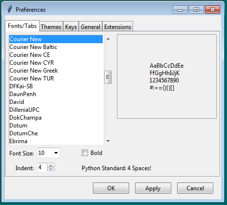
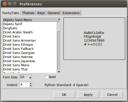
For the record, the fonts that Tk chose for TkFixedFont are Monaco 11 on Mac OS X, Courier New 10 on Windows, and DejaVu Sans Mono 10 on Linux (Ubuntu 14 to be specific).
Around the Text Widget
There were a few other cosmetic things that just weren't right around the edge of the main window [Issue#24750]. Look back at the earlier screen shots of the IDLE main window.
Notice there's a border around the text widget. It's most noticeable on OS X where it's a dark black, somewhat less so on Linux, and barely perceptible on Windows. This is the result of Tk's "highlightthickness" attribute, which is present when the text widget has the focus.
If the text widget doesn't have the focus, such as when the window becomes inactive, the highlight goes away:
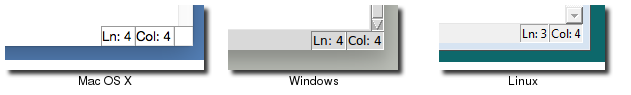
Status Bar on Inactive Window
Notice how on the Mac OS X screenshot, without the highlight, the status bar at the bottom of the window blends into the text widget. Not good.
As you'll see from looking at other applications, the border around the text widget is no longer a common convention. So let's start by removing that, which is as easy as adding "highlightthickness=0" when we create the text widget.
That still leaves us with the problem of the status bar blending into the editor. We changed the status bar to be a "ttk.Frame" widget, which has a background shading on all platforms. We also placed a "ttk.Separator" widget just above the status bar, to give us that clean separation.
Each of the line and column indicators were labels, previously created with:
label = Label(self, bd=1, relief=SUNKEN, anchor=W)
This was replaced with a "ttk.Label", to ensure it matched the frame. We also did away with the 1990's sunken "3d" look.
label = ttk.Label(self)
There's one last thing, and that's the empty space at the bottom right of the window on Mac OS X. This used to be occupied by the little widget that allowed you to resize the window. Mac OS X 10.7 added the ability to resize windows by dragging any side (like every other platform had) and did away with the resize widget in the corner.
Tk provides the "ttk::Sizegrip" widget to place in the corner if you need it, but unfortunately doesn't help when it comes to whether or not you need it. So that's up to you. IDLE now uses this code:
def need_sizegrip():
    """
    Older versions of OS X in particular require a ttk::sizegrip widget
    at the bottom right corner of the window. This is no longer the case
    in more recent versions.
    """
    if sys.platform == 'darwin':
        v, _, _ = platform.mac_ver()
        major, minor = v.split('.')[:2]
        if (int(major) == 10 and int(minor) < 7):
            return True
    return False

    ...
    if need_sizegrip():
           sz = ttk.Sizegrip(...)
Last, but not least, we can replace the original Tk scrollbar with the newer "ttk.Scrollbar" widget.
The resulting changes to the main window are shown below. Despite these being fairly minor, often subtle changes, they go a long way towards IDLE's main window looking a lot cleaner, more modern, and "just fitting in" on all platforms.
IDLE's main window, with improvements (Mac OS X)
IDLE's main window, with improvements (Windows)
IDLE's main window, with improvements (Linux)
Preferences Dialog
One visible piece that greatly needed improvement was the Preferences dialog. Again, here are screenshots on the three platforms:
IDLE's Preferences window (Mac OS X)
IDLE's Preferences window (Windows)
IDLE's Preferences window (Linux)
The other tabs allow you to modify individual colors for syntax highlighting, keystrokes assigned to particular operations, and a few other miscellaneous things.
While there was some debate as to the need for this level of configuration on what was primarily a learning environment [Issue#24810], it seemed reasonable to at least make what was there look and work better before considering any more radical surgery.
Among other things, the Preferences dialog was changed from modal (which, amusingly enough, didn't quite work on OS X, allowing multiple copies to be created) to modeless [Issue#24760], though I won't go further into that at this point.
Tabs
The first issue to address was the tabs used to switch between the four different preference panes. The original used a custom "megawidget", as classic Tk doesn't have its own widget. While the Windows and Linux ones don't look too bad, on recent versions of OS X there is a built-in tab widget that looks quite different.
It's actually more common in Mac OS X applications now to use something similar to a toolbar (row of icons with labels along the top or side) to switch between preference panes, though some programs do still use tabs. Tabs are very common on Windows and Linux.
The code was modified to use the "ttk.Notebook" widget, which not only looks better on each platform, but allows us to jettison a lot of code for managing tabs ourselves.
Updating Widgets
The next obvious step was upgrading the "classic" widgets to their themed counterparts. On this screen, that included the buttons, labels, frames, checkbox, scrollbar, etc. There were a few others on some of the other panes. Generally, this was a straightforward process, often involving removing widget options that were no longer needed or supported by the themed widgets.
Sometimes choosing a different widget made more sense. In this screen the option menu used for font size was better replaced by a combobox. Similarly, the scale widget is not commonly seen in today's user interfaces, and was replaced with the more familiar (and compact) spinbox widget.
There were also various non-standard ways of using certain widgets or specifying certain types of data. These were generally modified to use more familiar paradigms. There were a number of general issues discussed relating to the design of these dialogs, e.g. [Issue#24776], [Issue#24782].
Layout
While this dialog is a bad example, just given the space imbalance between the left and right halves, a lot of time was spent in general looking at widget spacing and alignment in dialog boxes.
The general approach was to find similar examples in other applications, and use those as a guide. Where are the buttons located? How are multiple fields of a dialog organized? Where are labels relative to the widget they're labelling? Are they left or right aligned, capitalized, do they have a trailing colon? These are the sorts of questions to think about.
A great starting point is converting from using the old 'pack' geometry manager to 'grid'. Because of the way it works, pack-based layouts tend to have weird and inconsistent alignment and spacing, especially if they've been modified over time. Using grid will increase maintainability, both because it uses a more familiar mental model, and because it's not dependent on the order in which widgets are inserted.
It's likely impossible to come up with one layout that looks fantastic on all platforms, but often you can come up with one (possibly with a couple platform-specific tweaks in the code) that looks decent.
A revised version of the dialog, incorporating many of the techniques here, is shown below.
IDLE Preferences, revised version (Mac OS X)
IDLE Preferences, revised version (Windows)
IDLE Preferences, revised version (Linux)
Another Example
The screenshot below shows a before and after of the IDLE Preferences pane which controls syntax coloring [Issue#24781].
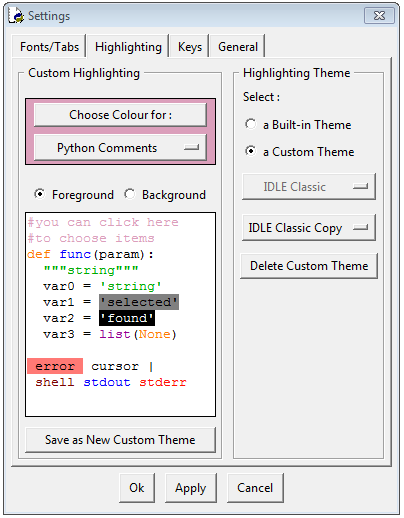
IDLE Themes Pane, before (Windows)
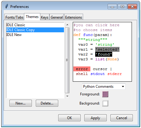
IDLE Themes Pane, after (Windows)
Again, substituting widgets and using more familiar conventions is one piece of this. I think the bigger changes have to do with thinking about things from the user perspective. Particularly as a beginner tool, if you're in here at all it's probably to switch themes, not tweak colors, so that is more dominant in the new version. It also does away with an arbitrary distinction between "built-in" and "custom" themes.
I think the new version is a big improvement, though as of this writing I have yet to convince some people of this. This being open source, we'll see what happens!
Other Dialogs
There are multiple other dialog boxes in IDLE; we'll consider a couple more examples here.
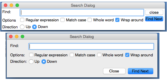
Find Dialog
Planning on doing some more changes on these, likely combining Find and Replace into a single dialog.
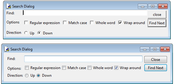
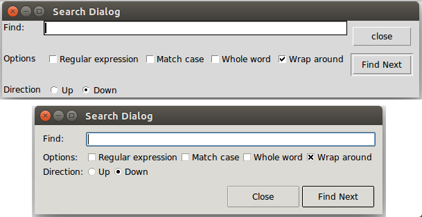
One of the find/search dialogs is shown below [Issue#23218], again with before and after on the three platforms.
IDLE Find Dialog, before and after (Mac OS X)
IDLE Find Dialog, before and after (Windows)
IDLE Find Dialog, before and after (Linux)
The first step was upgrading the widgets to use the equivalent themed widgets. The effect of this is most obvious with the buttons (being consistent with the capitalization doesn't hurt either).
Speaking of buttons, notice that in the new version, the buttons are on the right on Windows (where they were on all before), but at the bottom for Mac OS X and Linux. On examining multiple different applications our target users would likely have encountered on each platform, we found these locations were common. With only a few lines of extra code needed to special case for this layout difference, it made sense to handle things this way.
Other aspects of the layout were also improved. Looking at the original dialogs (especially how the buttons don't quite line up with other widgets) I originally thought it was created with pack, and expected to convert it to grid. Interestingly, it was already using grid. Why then the unaligned widgets, a hallmark of pack-based layouts?
This turned out to be a result of using many nested frames. For example the buttons were placed into their own frame, and then that placed into the rest of the window. Because of that, the individual buttons couldn't be aligned with widgets in the rest of the user interface.
Nested frames were required when using pack, but often with grid it is better to avoid them except in exceptional circumstances. That allows you to make different parts of the user interface line up (at the expense of dealing with a lot of columnspan/rowspan tweaking).
A more substantial reorganization would have likely removed the nested frames, but particularly with adjusting the buttons, this relatively simple layout could be made to work with just a few tweaks.
You'll notice a lot of older Tkinter user interfaces have the problem here of their contents running to the edge of the windows, which often doesn't look right. I've gotten into the habit of placing a ttk.Frame directly inside each toplevel, with some additional padding, and then placing the rest of the user interface inside that.
Like Preferences, the Find dialogs were also modal, which meant you had to dismiss them before doing any editing of your file, though at least they did remember the previous settings when you reopened them. These were eventually changed to be regular modeless windows.
About Dialog
Speaking of modal dialogs, the About box was also originally modal. Not only that, getting more information (e.g. the IDLE README file), resulted in launching another modal dialog, which needed to be dismissed to go back to the first modal dialog, which needed... etc.
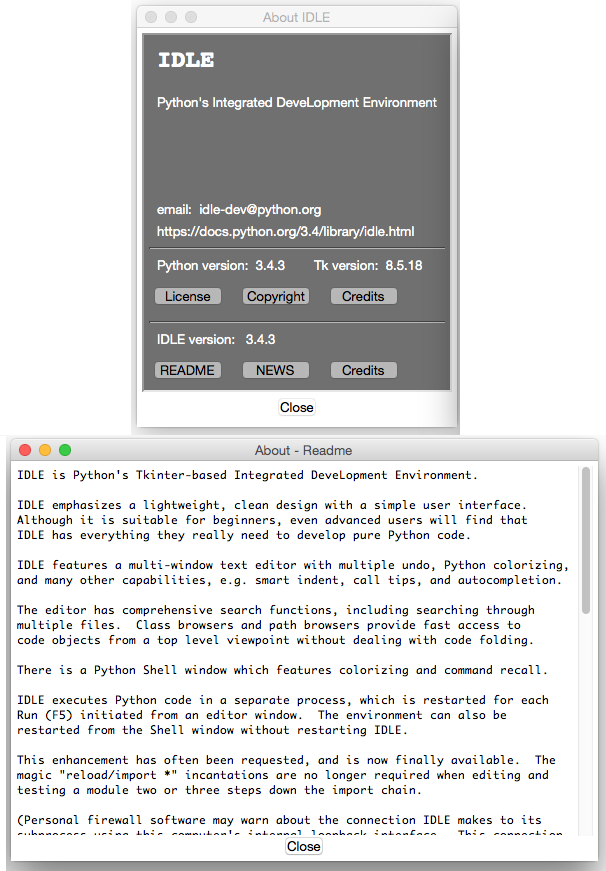
IDLE's doubly-modal About dialog (Mac OS X)
Making the dialog non-modal was the first priority. Second, the nested dialogs were eliminated, using a progressive disclosure technique. The dialog when launched is fairly sparse, but contains a 'More...' "link", which when clicked expands the window to show one of the documentation files, with an option to switch to any of the others.
The 'More...' "link" is effectively playing the role of a button, but taking advantage of everyone's familiarity with web browsers to provide a visually simpler alternative. As far as implementation, we use a (classic, non-themed) label widget, colored blue, and attach a mouse click binding to it.
One thing you can do to help convey that the link is clickable is change the cursor when the mouse is over it (via the "cursor" option found on many widgets). On OS X, choose the platform-specific "pointinghand" cursor, on Windows and Linux choose the "hand2" cursor, which actually gets mapped to something more appropriate on those platforms.
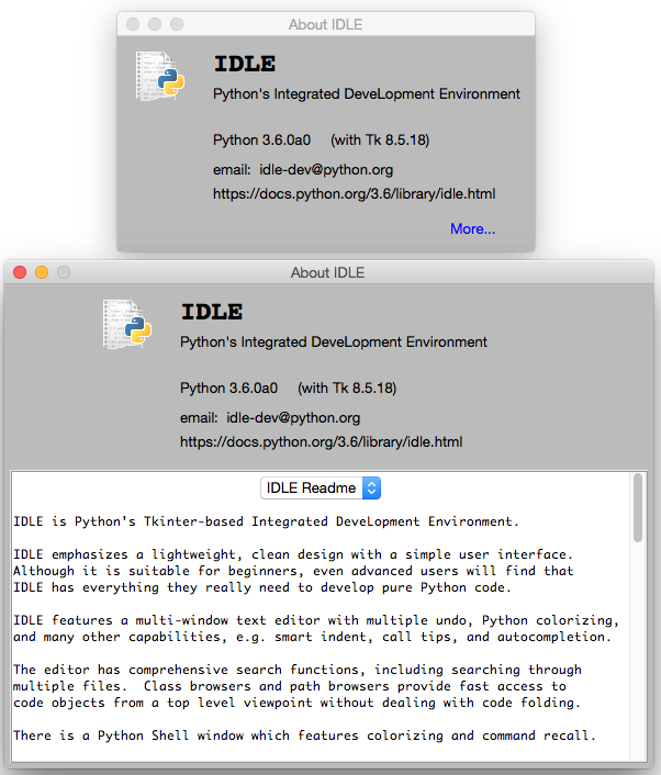
Revised About Box (Mac OS X)
Online Help
IDLE also had a (needless to say, modal) help dialog which displayed information on using the program. This displayed a plain text help file that looked similar to the 'About - Readme' window above.
At the same time, like the rest of Python, there was reference documentation, created as "restructured text" which can then be formatted using a tool called Sphinx into HTML, text, etc.
The documentation in IDLE's help dialog was based on a separate, but similar plain text file. Keeping the two in sync was a problem. They were separate because Sphinx's plain text rendering didn't look all that good, and all the extra navigation etc. in the HTML rendering wouldn't be needed for online help, and then there's the hassle of opening a web browser, etc. [Issue#16893]
Tk's text widget is smart enough to handle the very basic formatting used in IDLE's documentation, and Python includes an HTML parser in its standard library. Putting the two together made displaying a simplified version of the HTML reference documentation easy.
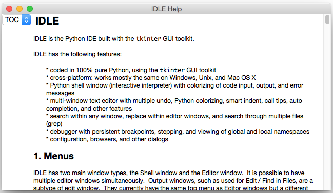
Online Help using text widget (Mac OS X)
It's easy to get carried away here. Back in the mid-1990's, a tiny HTML parser in Tcl spawned a slew of "web browser in a text widget" adventures, first in Tcl and then in other languages, e.g. Python's Grail. Trying to keep up with everything that large teams of developers are putting into real web browsers is a fool's errand. Yet, for very limited and constrained subsets of HTML as might be found in online help, it's an entirely reasonable approach.
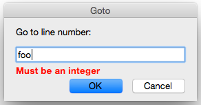
Query Dialogs
Still with the modal dialog theme, IDLE used the "simpledialog" package which is distributed as part of Tkinter to request certain small pieces of information from the user via modal dialogs. An example is the "Goto line..." command. This, along with an example of the alert that is presented if you type in something invalid is shown below.
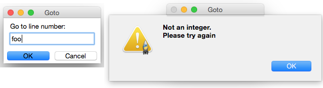
Goto line dialog and error handling (Mac OS X)
The alert-on-dialog isn't quite as bad as the dialog-on-dialog pattern we saw before. But these dialogs could certainly stand to be cosmetically updated, and a few other tweaks made. For example, while they correctly interpreted hitting the Return or Escape keys as synonymous with pressing OK or Cancel, they didn't also allow for the alternate Mac conventions (Enter key on numeric keypad and Command-period) [Issue#24812]. There were some other customizations that would have been nice to have, e.g. changing the name of the OK button, that simpledialog didn't support.
Regarding the error handling, things were in some cases handled worse. For example, there is a command to open an editor window containing the source of a module from Python's stdlib. See what happens if you make a typo.
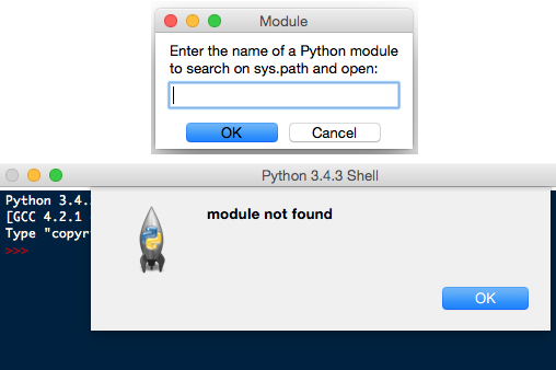
Open module dialog with error (Mac OS X)
Because the dialog doesn't know if the module name is correct, validation isn't done until after the dialog is dismissed. So the error alert gets attached to another window, and to try again you have to dismiss that and go to the menu to reopen the dialog, and try again (from scratch).
There were a couple of places in the code where more validation in the dialog was really necessary. Because the "simpledialog" code was part of Tkinter, and wasn't readily extensible in the ways needed, developers had to resort to "inheritance by text editor" (i.e. copy the entire simpledialog code and modify the copy). Twice, separately.
Since the appearance needed to be updated anyway, we generalized things, and ignored what was in Tkinter's simpledialog module altogether. Instead, a single general-purpose replacement was created that could be used throughout IDLE (and still resulted in less code).
New query dialog (Mac OS X)
Besides the updated widgets and alignment, notice how error messages from invalid input are now shown in the dialog itself (a technique seen frequently in web applications), rather than a separate alert. For OS X, we also made sure to add key bindings for the numeric keypad Enter key and Command-period, and also made sure the window looked like a modal dialog is supposed to via this little gem:
self.tk.call('::tk::unsupported::MacWindowStyle', 'style', self._w,
             'moveableModal', '')
As far as validation, the query dialog was structured to accept a validation callback, which could then handle arbitrary criteria. For example, here is the validation code used when people enter the name of a new theme, to make sure it fits certain syntactical requirements, and also hasn't been already used.
def newtheme(self):
    def validate_theme(s):
        if not s:
            raise ValueError('Cannot be blank')
        if len(s) > 30:
            raise ValueError('Cannot be longer than 30 characters')
        if s in self.all_theme_names():
            raise ValueError('Name already used')
    new_theme = querydialog.askstring(parent=self, prompt='...',
            title='Create New Theme', validatecmd=validate_theme)
    if new_theme is not None:
        ...
A generic 'integer' validation callback, with an optional minimum and maximum, was added as part of the query dialog module to be used for dialogs like the 'Goto line...' dialog.
Dialog Placement
A number of dialogs, including alerts, file save, etc. were appearing in the middle of the screen, rather than close to the window that they were associated with. [Issue#25173]
Choosing the right window as the parent of the dialog is important, because it ensures the dialog window appears near that window. On Mac OS X, these dialogs are often attached to the title bar of the parent window (see the error alerts in the previous section).
The front ends to these dialogs in Tkinter support both a master and a parent. While most of the time, "master" and "parent" are used interchangeably in Tkinter, that's not the case here. If you provide only the master, the dialog won't be attached to that window (but the dialog still needs an existing window to create the dialog, which is why the master parameter is there). If the dialog is associated with another window, be sure to use the parent parameter.
Window Integration
Multiple people had hoped to make it possible to have everything displayed in a single window, to avoid the window management hassles that can sometimes trip up people, e.g. [Issue#9262], [Issue#24826], [Issue#24818].
Below is an early, partially functional, mockup of some of the things we wanted to be able to accomplish.
Early mockup of window integration (Mac OS X)
At this point, almost everything here has been completed, and it ended up looking almost identical to the original mockup. See, once in a while it happens!
Tabbed Editor
Even beginner programmers have to juggle multiple different source files. If each gets its own window, as was the case originally in IDLE, things can get messy and/or lost pretty quickly. Using tabs to organize multiple files in a single window is a familiar, effective solution.
When architecting your application, don't build large components as subclasses of Toplevel, or assume they'll be the only thing in the window in the future. Getting around that assumption in the code took a large amount of work. If components are instead built as frames, they can be more easily inserted into a toplevel, a paned window, a tabbed notebook, another frame, etc.
Luckily, we can rely on the ttk.Notebook widget to provide the tabbed user inteface, just like we did in Preferences.
Or maybe not.
Unfortunately, the ttk.Notebook widget (and the underlying platform widgets it uses) only really support displaying and switching between a small, fixed number of tabs. There's nothing built-in to support adding or closing tabs from the user interface, which we definitely need here. And as every programmer knows, it is more than possible to need a large number of tabs.
As you've seen in different editors and word processors, everyone does things slightly differently. We did our own custom tab widget (sigh...) for IDLE. The design borrowed heavily from the TextMate editor on the Mac. It allows creating new tabs, closing old ones, dragging to rearrange the order, tooltips on each tab, indicating if the contained file needed saving, etc. When the number of tabs grows too large to comfortably display, the remainder are accessible via a popup menu on the last visible tab.
The tabbed widget implementation relies on a single Tkinter canvas to display the row of tabs and handle all interaction. The actual switching of window content is handled completely outside of the widget, with a simple callback mechanism used to coordinate everything.
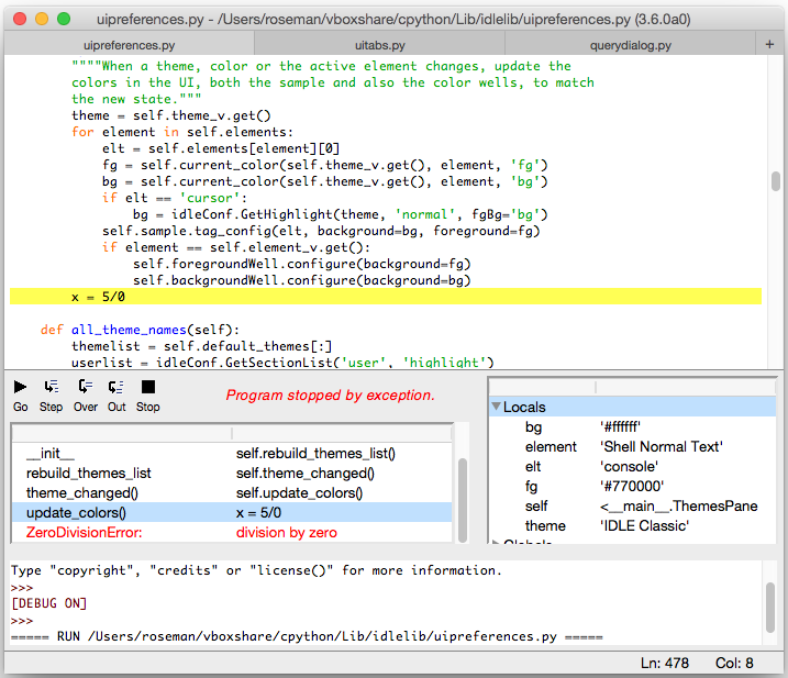
Debugger
The design of the original debugger, along with having it's own set of flaws [Issue#17942], was too tall to be integrated like we wanted to do.
Original IDLE Debugger (Mac OS X)
The user interface was substantially revised, with a layout that would work both in a standalone window, and when integrated. The new version uses a paned window to separate the controls and stack on the left from the variable display on the right. Both the stack and variable display are implemented using tree view widgets. This also provides a great deal of control when it comes to how much space each element will use.
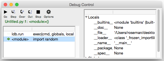
New IDLE Debugger (Mac OS X)
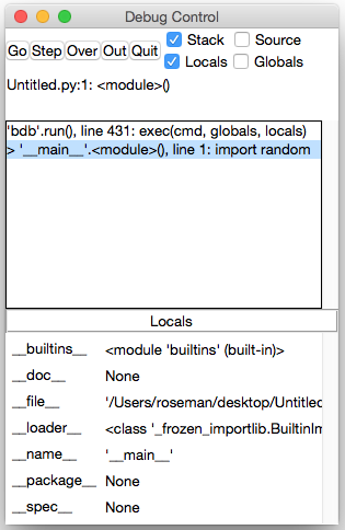
Integrated Shell and Debugger
To achieve the integration of the shell and the debugger with the tabbed editor, another paned window was used. Additional controls will be added to show/hide the panes as the implementation progresses.
The embedded shell is interesting too. Recall that IDLE normally has a single Python shell window running another Python process; when modules in an editor are "run" they do so via that shell. It's nice to have that big shell available, and we don't necessarily want to start up a separate shell in the editor.
New in Tk 8.5, the Text widget actually supports the ability to create "peers", which are separate widgets, but they share the same text backend. That means when something changes in one, it changes in the other. It's a seamless way to solve our problem here.
Workarounds, Hacks, and More
This being a chapter on actual experiences modernizing a real application, it would be a lie to say that the underlying user interface toolkit (Tk and the Tkinter wrapper) always worked exactly as it should. Like IDLE, Tkinter and Tcl/Tk are the results of incredible volunteer efforts. That being said...
Tk and Tkinter have some bugs and rough edges. I know, you're shocked.
In this section, I'll try to catalog just a few of the particular "gotchas" that we ran into, as well as provide some little tips that don't necessarily fit elsewhere, but help provide a bit more polish to the user interface.
Tool Tips
- tool tips broken on mac [Issue#24570]
- MacWindowStyle help for tooltips, vs. wm overrideredirect elsewhere
Context Menus
- bogus text widget bindings interfere with popup clicks [Issue#24801]
- two different popup click bindings needed on Mac [Issue#24801]
Peer Text Widgets
- broken peer text widget API in Tkinter [Issue#17945]
Modal Windows
- mac not doing fully modal, plus window style [Issue#24760]