
 If you've found the material on this site useful, please consider purchasing this
e-book (only $10), which is based on the Python material in the tutorial. Doing so helps me
maintain and update this site. Thank you very much!
If you've found the material on this site useful, please consider purchasing this
e-book (only $10), which is based on the Python material in the tutorial. Doing so helps me
maintain and update this site. Thank you very much!

@markroseman
mark@markroseman.com
 Buy now for your Kindle
 Buy the DRM-free PDF
Essentials
- Tk Backgrounder
- Installing Tk
- Tutorial
- Widget Roundup
- Languages Using Tk
- Official Tk Command Reference
(Tcl-oriented; at www.tcl.tk)
Tutorial
More Widgets
This chapter carries on introducing several more widgets: listbox, scrollbar, text, progressbar, scale and spinbox. Some of these are starting to be a bit more powerful than the basic ones we looked at before. Here we'll also see a few instances of using the classic Tk widgets, in instances where there isn't (or there isn't a need for) a themed counterpart.
Listbox
A listbox displays a list of single-line text items, usually lengthy, and allows the user to browse through the list, selecting one or more.
Listboxes are part of the classic Tk widgets; there is not presently a listbox in the themed Tk widget set.
Tk's treeview widget (which is themed) can also be used as a listbox (a one level deep tree), allowing you to use icons and styles with the list. It's also likely that a multi-column (table) list widget will make it into Tk at some point, based on one of the available extensions.
Listbox Widgets
Listboxes are created using the tk::listbox command:
tk::listbox .l -height 10
Listboxes are created using the TkListbox class:
l = TkListbox.new(parent) {height 10}Listboxes are created using the new_tk__listbox method, a.k.a. Tkx::tk__listbox:
$parent->new_tk__listbox(-height => 10)
Listboxes are created using the Listbox function:
l = Listbox(parent, height=10)
Populating the Listbox Items
There's an easy way and a hard way to populate and manage all the items that are contained in the listbox.
Here is the easy way. Each listbox has a "listvariable" configuration option, which allows you to link a variable (which must hold a list) to the listbox. Each element of this list is a string representing one item in the listbox. So to add, remove, or rearrange items in the listbox, you can simply manipulate this variable as you would any other list. Similarly, to find out which item is on the third line of the listbox, just look at the third element of the list variable.
Unfortunately, you can't pass a reference to a Perl list for this "listvariable" parameter. It actually requires a Tcl formatted list, which is a string with elements separated by spaces, and braces around all but the simplest elements. So, you'll need to do the conversion yourself. There's a simple one-liner in the upcoming example that handles converting fairly simple lists, but for unknown data you'll need something more robust.
The reason there is a hard way at all is because the "listvariable" option was only introduced in Tk 8.3. Before that, you were stuck with the hard way. Because using the list variable lets you use all the standard list operations, it provides a much simpler API, and is certainly an upgrade worth considering if you have listboxes doing things the older way.
The older, harder way to do things is use a set of methods that are part of the listbox widget itself that operate on the (internal) list of items:
- The "insert idx item ?item... ?" method is used to add one or more items to the list; "idx" is a 0-based index indicating the position of the item before which the item(s) should be added; specify "end" to put the new items at the end of the list.
- Use the "delete first ?last?" method to delete one or more items from the list; "first" and "last" are indices as per the "insert" method.
- Use the "get first ?last?" method to return the contents of a single item at the given position, or a list of the items between "first" and "last".
- The "size" method returns the number of items in the list.
Selecting Items
The first thing you need to decide is whether it is possible for the user to select only a single item at a time, or if multiple items can simultaneously be selected. This is controlled by the "selectmode" option: the default is only being able to select a single item ("browse"), while a selectmode of "extended" allows the user to select multiple items.
The names "browse" and "extended", again for backwards compatibility reasons, are truly awful. This is made worse by the fact that there are two other modes, "single" and "multiple" which you should not use (they use an old interaction style that is inconsistent with modern user interface and platform conventions).
To find out which item or items in the listbox the user has currently selected, use the "curselection" method, which will return the list of indices of all items currently selected; this may be an empty list, and for lists with a selectmode of "browse", will never be longer than one item. You can also use the "selection includes index" method to check if the item with the given index is currently selected.
To programmatically change the selection, you can use the "selection clear first ?last?" method to deselect either a single item, or any within the range of indices specified. To select an item, or all items in a range, use the "selection set first ?last?" method. Both of these will not touch the selection of any items outside the range specified.
If you do change the selection, you should also make sure that the newly selected item is visible to the user (i.e. it is not scrolled out of view). To do this, use the "see index" method.
When the selection is changed by the user, a "<ListboxSelect>" virtual event is generated. You can bind to this to take any action you need. Depending on your application, you may also want to bind to a double-click "Double-1" event, and use it to invoke an action with the currently selected item.
Stylizing the List
Like most of the "classic" Tk widgets, you have immense flexibility in modifying the appearance of a listbox. As described in the reference manual, you can modify the font the listbox items are displayed in, the foreground (text) and background colors for items in their normal state, when selected, when the widget is disabled, and so on. There is also an "itemconfigure" method which allows you to change the foreground and background colors of individual items.
As is often the case, restraint is useful. Generally, the default values will be entirely suitable, and a good match for platform conventions. In the example we'll get to momentarily, we'll show how restrained use of these options can be put to good effect, in this case displaying alternate lines of the listbox in slightly different colors.
Keeping Extra Item Data
The "listvariable" (or the internal list, if you're managing things the old way) contains the strings that will be shown in the listbox. It's very often the case though that each string in your program is associated with some other data item, and what you're really interested in is not so much the string displayed in the listbox, but the associated data item. For example, a listbox containing names may be what is presented to the user, but your program is really interested in the user object (or id number) that is selected, not the particular name.
How can we associate this value with the displayed name? Unfortunately, the listbox widget itself doesn't offer any facilities, so it's something we'll have to manage separately. There are a couple of obvious approaches. First, if the displayed strings are guaranteed unique, you could use a hash table to map the names to the associated object. So, given the name you can easily get the associated object. This probably wouldn't work well for doing names, but could work for choosing countries for example.
A second approach is to keep a second list, parallel to the list of strings displayed in the listbox, which will hold the associated objects. So the first item in the strings list corresponds to the first item in the objects list, the second to the second, and so on. Any changes you make in one list (insert, delete, reorder) you need to make in the other. You can then easily map from the list item to the underlying object, based on their position in the list.
Example
Here is a silly example showing these various listbox techniques. We'll have a list of countries displayed. Behind the scenes, we have a database (a simple hash table) which contains the population of each country, indexed by the two letter country code. We'll be able to select only a single country at a time, and as we do so, a status bar will display the population of the country. Double-clicking on the list, or hitting the Return key, will send one of several gifts to the selected country's head of state (well, not really, but use your imagination).
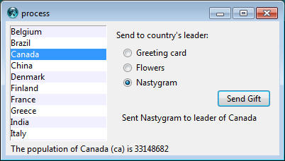
Country Selector Listbox Example
# Initialize our country "databases":
#  - the list of country codes (a subset anyway)
#  - a parallel list of country names, in the same order as the country codes
#  - a hash table mapping country code to population<
set countrycodes [list ar au be br ca cn dk fi fr gr in it jp mx nl no es se ch]
set countrynames [list Argentina Australia Belgium Brazil Canada China Denmark \
        Finland France Greece India Italy Japan Mexico Netherlands Norway Spain \
        Sweden Switzerland]
array set populations [list ar 41000000 au 21179211 be 10584534 br 185971537 \
        ca 33148682 cn 1323128240 dk 5457415 fi 5302000 fr 64102140 gr 11147000 \
        in 1131043000 it 59206382 jp 127718000 mx 106535000 nl 16402414 \
        no 4738085 es 45116894 se 9174082 ch 7508700]

# Names of the gifts we can send
array set gifts [list card "Greeting card" flowers "Flowers" nastygram "Nastygram"]

# Create and grid the outer content frame
grid [ttk::frame .c -padding "5 5 12 0"] -column 0 -row 0 -sticky nwes
grid columnconfigure . 0 -weight 1; grid rowconfigure . 0 -weight 1

# Create the different widgets; note the variables that many
# of them are bound to, as well as the button callback.
# The listbox is the only widget we'll need to refer to directly
# later in our program, so for convenience we'll assign it to a variable.
set ::lbox [tk::listbox .c.countries -listvariable countrynames -height 5]
ttk::label .c.lbl -text "Send to country's leader:"
ttk::radiobutton .c.g1 -text $gifts(card) -variable gift -value card
ttk::radiobutton .c.g2 -text $gifts(flowers) -variable gift -value flowers
ttk::radiobutton .c.g3 -text $gifts(nastygram) -variable gift -value nastygram
ttk::button .c.send -text "Send Gift" -command {sendGift} -default active
ttk::label .c.sentlbl -textvariable sentmsg -anchor center
ttk::label .c.status -textvariable statusmsg -anchor w

# Grid all the widgets
grid .c.countries -column 0 -row 0 -rowspan 6 -sticky nsew
grid .c.lbl       -column 1 -row 0 -padx 10 -pady 5
grid .c.g1        -column 1 -row 1 -sticky w -padx 20
grid .c.g2        -column 1 -row 2 -sticky w -padx 20
grid .c.g3        -column 1 -row 3 -sticky w -padx 20
grid .c.send      -column 2 -row 4 -sticky e
grid .c.sentlbl   -column 1 -row 5 -columnspan 2 -sticky n -pady 5 -padx 5
grid .c.status    -column 0 -row 6 -columnspan 2 -sticky we
grid columnconfigure .c  0 -weight 1; grid rowconfigure .c 5 -weight 1

# Set event bindings for when the selection in the listbox changes,
# when the user double clicks the list, and when they hit the Return key
bind $::lbox <<ListboxSelect>> "showPopulation"
bind $::lbox <Double-1> "sendGift"
bind . <Return> "sendGift"

# Called when the selection in the listbox changes; figure out
# which country is currently selected, and then lookup its country
# code, and from that, its population.  Update the status message
# with the new population.  As well, clear the message about the
# gift being sent, so it doesn't stick around after we start doing
# other things.
proc showPopulation {} {
    set idx [$::lbox curselection]
    if {[llength $idx]==1} {
        set code [lindex $::countrycodes $idx]
        set name [lindex $::countrynames $idx]
        set popn $::populations($code)
        set ::statusmsg "The population of $name ($code) is $popn"
    }
    set ::sentmsg ""
}

# Called when the user double clicks an item in the listbox, presses
# the "Send Gift" button, or presses the Return key.  In case the selected
# item is scrolled out of view, make sure it is visible.
#
# Figure out which country is selected, which gift is selected with the
# radiobuttons, "send the gift", and provide feedback that it was sent.
proc sendGift {} {
    set idx [$::lbox curselection]
    if {[llength $idx]==1} {
        $::lbox see $idx
        set name [lindex $::countrynames $idx]
        # Gift sending left as an exercise to the reader
        set ::sentmsg "Sent $::gifts($::gift) to leader of $name"
    }
}

# Colorize alternating lines of the listbox
for {set i 0} {$i<[llength $countrynames]} {incr i 2} {
    $::lbox itemconfigure $i -background #f0f0ff
}

# Set the starting state of the interface, including selecting the
# default gift to send, and clearing the messages.  Select the first
# country in the list; because the <<ListboxSelect>> event is only
# generated when the user makes a change, we explicitly call showPopulation.
set gift card
set sentmsg ""
set statusmsg ""
$::lbox selection set 0
showPopulation
require 'tkextlib/tile'

# Initialize our country "databases":
#  - the list of country codes (a subset anyway)
#  - a parallel list of country names, in the same order as the country codes
#  - a hash table mapping country code to population
$countrycodes = %w{ ar au be br ca cn dk fi fr gr in it jp mx nl no es se ch }
$countrynames = %w{ Argentina Australia Belgium Brazil Canada China Denmark
        Finland France Greece India Italy Japan Mexico Netherlands Norway Spain
        Sweden Switzerland}
$populations = { 'ar' => 41000000, 'au' => 21179211, 'be' => 10584534, 'br' => 185971537,
        'ca' => 33148682, 'cn' => 1323128240, 'dk' => 5457415, 'fi' => 5302000,
        'fr' => 64102140, 'gr' => 11147000, 'in' => 1131043000, 'it' => 59206382,
        'jp' => 127718000, 'mx' => 106535000, 'nl' => 16402414, 'no' => 4738085,
        'es' => 45116894, 'se' => 9174082, 'ch' => 7508700}

# Names of the gifts we can send
$gifts = { 'card' => "Greeting card", 'flowers' => "Flowers", 'nastygram' => "Nastygram" }

# Create and initialize the linked variables we'll need in the interface
$gift = TkVariable.new( "card" )
$names = TkVariable.new ( $countrynames )
$sent = TkVariable.new ( "" )
$status = TkVariable.new ( "" )

# Create and grid the outer content frame
root = TkRoot.new
content = Tk::Tile::Frame.new(root) {padding "5 5 12 0"}.grid :column => 0, :row => 0, :sticky => "nwes"
TkGrid.columnconfigure root, 0, :weight => 1
TkGrid.rowconfigure root, 0, :weight => 1

# Create the different widgets; note the variables that many
# of them are bound to, as well as the button callback.
$countries = TkListbox.new(content) {listvariable $names; height 5}
sendlbl = Tk::Tile::Label.new(content) {text "Send to country's leader:"}
gift1 = Tk::Tile::Radiobutton.new(content) {text $gifts['card']; variable $gift; value 'card'}
gift2 = Tk::Tile::Radiobutton.new(content) {text $gifts['flowers']; variable $gift; value 'floweres'}
gift3 = Tk::Tile::Radiobutton.new(content) {text $gifts['nastygram']; variable $gift; value 'nastygram'}
send = Tk::Tile::Button.new(content) {text "Send Gift"; command "sendGift"; default "active"}
sentlbl = Tk::Tile::Label.new(content) {textvariable $sent; anchor "center"}
statuslbl = Tk::Tile::Label.new(content) {textvariable $status; anchor "w"}

# Grid all the widgets
$countries.grid :column => 0, :row => 0, :rowspan => 6, :sticky => 'nsew'
sendlbl.grid    :column => 1, :row => 0, :padx => 10, :pady => 5
gift1.grid      :column => 1, :row => 1, :sticky => 'w', :padx => 20
gift2.grid      :column => 1, :row => 2, :sticky => 'w', :padx => 20
gift3.grid      :column => 1, :row => 3, :sticky => 'w', :padx => 20
send.grid       :column => 2, :row => 4, :sticky => 'e'
sentlbl.grid    :column => 1, :row => 5, :columnspan => 2, :sticky => 'n', :pady => 5, :padx => 5
statuslbl.grid  :column => 0, :row => 6, :columnspan => 2, :sticky => 'we'

TkGrid.columnconfigure content, 0, :weight => 1
TkGrid.rowconfigure content, 5, :weight => 1

# Set event bindings for when the selection in the listbox changes,
# when the user double clicks the list, and when they hit the Return key
$countries.bind '<ListboxSelect>', proc{showPopulation}
$countries.bind 'Double-1', proc{sendGift}
root.bind 'Return', proc{sendGift}

# Called when the selection in the listbox changes; figure out
# which country is currently selected, and then lookup its country
# code, and from that, its population.  Update the status message
# with the new population.  As well, clear the message about the
# gift being sent, so it doesn't stick around after we start doing
# other things.
def showPopulation
    idx = $countries.curselection
    if idx.length==1
        idx = idx[0]
        code = $countrycodes[idx]
        name = $countrynames[idx]
        popn = $populations[code]
        $status.value = "The population of #{name} (#{code}) is #{popn}"
    end
    $sent.value = ""
end

# Called when the user double clicks an item in the listbox, presses
# the "Send Gift" button, or presses the Return key.  In case the selected
# item is scrolled out of view, make sure it is visible.
#
# Figure out which country is selected, which gift is selected with the
# radiobuttons, "send the gift", and provide feedback that it was sent.
def sendGift
    idx = $countries.curselection
    if idx.length==1
        idx = idx[0]
        $countries.see idx
        name = $countrynames[idx]
        # Gift sending left as an exercise to the reader
        $sent.value = "Sent #{$gifts[$gift.value]} to leader of #{name}"
    end
end

# Colorize alternating lines of the listbox
0.step($countrycodes.length-1, 2) {|i| $countries.itemconfigure i, :background, "#f0f0ff"}

# Select the first country in the list; because the <<ListboxSelect>> event is only
# generated when the user makes a change, we explicitly call showPopulation.
$countries.selection_set 0
showPopulation

Tk.mainloop
use Tkx;

# Initialize our country "databases":
#  - the list of country codes (a subset anyway)
#  - a parallel list of country names, in the same order as the country codes
#  - a hash table mapping country code to population
@countrycodes = ("ar", "au", "be", "br", "ca", "cn", "dk", "fi", "fr", "gr", "in", "it", "jp", "mx",
                "nl", "no", "es", "se", "ch");
@countrynames = ("Argentina", "Australia", "Belgium", "Brazil", "Canada", "China", "Denmark",
        "Finland", "France", "Greece", "India", "Italy", "Japan", "Mexico", "Netherlands", "Norway", "Spain",
        "Sweden", "Switzerland");
%populations = ("ar" => 41000000, "au" => 21179211, "be" => 10584534, "br" => 185971537,
        "ca" => 33148682, "cn" => 1323128240, "dk" => 5457415, "fi" => 5302000, "fr" => 64102140, "gr" => 11147000,
        "in" => 1131043000, "it" => 59206382, "jp" => 127718000, "mx" => 106535000, "nl" => 16402414,
        "no" => 4738085, "es" => 45116894, "se" => 9174082, "ch" => 7508700);

# Names of the gifts we can send
%gifts =("card" => "Greeting card", "flowers" => "Flowers", "nastygram" => "Nastygram");

# Create and grid the outer content frame
$mw = Tkx::widget->new(".");
$content = $mw->new_ttk__frame(-padding => "5 5 12 0");
$content->g_grid(-column => 0, -row => 0, -sticky => "nwes");
$mw->g_grid_columnconfigure(0, -weight => 1);
$mw->g_grid_rowconfigure(0, -weight => 1);

# Create the different widgets; note the variables that many
# of them are bound to, as well as the button callback.
# The listbox is the only widget we'll need to refer to directly
# later in our program, so for convenience we'll assign it to a variable.
# Remember that we must use a Tcl formatted list for listvariable.
$cnames = ''; foreach $i (@countrynames) {$cnames = $cnames . ' {' . $i . '}';};
$lbox = $content->new_tk__listbox(-listvariable => \$cnames, -height => 5);
$lbl = $content->new_ttk__label(-text => "Send to country's leader:");
$g1 = $content->new_ttk__radiobutton(-text => $gifts{'card'}, -variable => \$gift, -value => 'card');
$g2 = $content->new_ttk__radiobutton(-text => $gifts{'flowers'}, -variable => \$gift, -value => 'flowers');
$g3 = $content->new_ttk__radiobutton(-text => $gifts{'nastygram'}, -variable => \$gift, -value => 'nastygram');
$send = $content->new_ttk__button(-text => "Send Gift", -command => sub {sendGift()}, -default => 'active');
$l1 = $content->new_ttk__label(-textvariable => \$sentmsg, -anchor => "center");
$l2 = $content->new_ttk__label(-textvariable => \$statusmsg, -anchor => "w");

# Grid all the widgets
$lbox->g_grid(-column => 0, -row => 0, -rowspan => 6, -sticky => "nsew");
$lbl->g_grid(-column => 1, -row => 0, -padx => 10, -pady => 5);
$g1->g_grid(-column => 1, -row => 1, -sticky => "w", -padx => 20);
$g2->g_grid(-column => 1, -row => 2, -sticky => "w", -padx => 20);
$g3->g_grid(-column => 1, -row => 3, -sticky => "w", -padx => 20);
$send->g_grid(-column => 2, -row => 4, -sticky => "e");
$l1->g_grid(-column => 1, -row => 5, -columnspan => 2, -sticky => "n", -pady => 5, -padx => 5);
$l2->g_grid(-column => 0, -row => 6, -columnspan => 2, -sticky => "we");
$content->g_grid_columnconfigure(0, -weight => 1);
$content->g_grid_rowconfigure(0, -weight => 1);


# Set event bindings for when the selection in the listbox changes,
# when the user double clicks the list, and when they hit the Return key
$lbox->g_bind("<<ListboxSelect>>", sub {showPopulation()});
$lbox->g_bind("<Double-1>", sub {sendGift()});
$mw->g_bind("<Return>", sub {sendGift()});

# Called when the selection in the listbox changes; figure out
# which country is currently selected, and then lookup its country
# code, and from that, its population.  Update the status message
# with the new population.  As well, clear the message about the
# gift being sent, so it doesn't stick around after we start doing
# other things.
sub showPopulation {
    my @idx = $lbox->curselection;
    if ($#idx==0) {
        my $code = $countrycodes[$idx[0]];
        my $name = $countrynames[$idx[0]];
        my $popn = $populations{$code};
        $statusmsg = "The population of " . $name . "(" . $code . ") is $popn";
    }
    $sentmsg = "";
}

# Called when the user double clicks an item in the listbox, presses
# the "Send Gift" button, or presses the Return key.  In case the selected
# item is scrolled out of view, make sure it is visible.
#
# Figure out which country is selected, which gift is selected with the
# radiobuttons, "send the gift", and provide feedback that it was sent.
sub sendGift {
    my @idx = $lbox->curselection;
    if ($#idx==0) {
        $lbox->see($idx[0]);
        my $name =$countrynames[$idx[0]];
        # Gift sending left as an exercise to the reader
        $sentmsg = "Sent " . $gifts{$gift} . " to leader of " . $name
    }
}

# Colorize alternating lines of the listbox
for ($i=0; $i<=$#countrynames; $i+=2) {
    $lbox->itemconfigure($i, -background => "#f0f0ff");
}

# Set the starting state of the interface, including selecting the
# default gift to send, and clearing the messages.  Select the first
# country in the list; because the <<ListboxSelect>> event is only
# generated when the user makes a change, we explicitly call showPopulation.
$gift = 'card';
$sentmsg = "";
$statusmsg = "";
$lbox->selection_set(0);
showPopulation;

Tkx::MainLoop();
from tkinter import *
from tkinter import ttk
root = Tk()

# Initialize our country "databases":
#  - the list of country codes (a subset anyway)
#  - a parallel list of country names, in the same order as the country codes
#  - a hash table mapping country code to population<
countrycodes = ('ar', 'au', 'be', 'br', 'ca', 'cn', 'dk', 'fi', 'fr', 'gr', 'in', 'it', 'jp', 'mx', 'nl', 'no', 'es', 'se', 'ch')
countrynames = ('Argentina', 'Australia', 'Belgium', 'Brazil', 'Canada', 'China', 'Denmark', \
        'Finland', 'France', 'Greece', 'India', 'Italy', 'Japan', 'Mexico', 'Netherlands', 'Norway', 'Spain', \
        'Sweden', 'Switzerland')
cnames = StringVar(value=countrynames)
populations = {'ar':41000000, 'au':21179211, 'be':10584534, 'br':185971537, \
        'ca':33148682, 'cn':1323128240, 'dk':5457415, 'fi':5302000, 'fr':64102140, 'gr':11147000, \
        'in':1131043000, 'it':59206382, 'jp':127718000, 'mx':106535000, 'nl':16402414, \
        'no':4738085, 'es':45116894, 'se':9174082, 'ch':7508700}

# Names of the gifts we can send
gifts = { 'card':'Greeting card', 'flowers':'Flowers', 'nastygram':'Nastygram'}

# State variables
gift = StringVar()
sentmsg = StringVar()
statusmsg = StringVar()

# Called when the selection in the listbox changes; figure out
# which country is currently selected, and then lookup its country
# code, and from that, its population.  Update the status message
# with the new population.  As well, clear the message about the
# gift being sent, so it doesn't stick around after we start doing
# other things.
def showPopulation(*args):
    idxs = lbox.curselection()
    if len(idxs)==1:
        idx = int(idxs[0])
        code = countrycodes[idx]
        name = countrynames[idx]
        popn = populations[code]
        statusmsg.set("The population of %s (%s) is %d" % (name, code, popn))
    sentmsg.set('')

# Called when the user double clicks an item in the listbox, presses
# the "Send Gift" button, or presses the Return key.  In case the selected
# item is scrolled out of view, make sure it is visible.
#
# Figure out which country is selected, which gift is selected with the
# radiobuttons, "send the gift", and provide feedback that it was sent.
def sendGift(*args):
    idxs = lbox.curselection()
    if len(idxs)==1:
        idx = int(idxs[0])
        lbox.see(idx)
        name = countrynames[idx]
        # Gift sending left as an exercise to the reader
        sentmsg.set("Sent %s to leader of %s" % (gifts[gift.get()], name))

# Create and grid the outer content frame
c = ttk.Frame(root, padding=(5, 5, 12, 0))
c.grid(column=0, row=0, sticky=(N,W,E,S))
root.grid_columnconfigure(0, weight=1)
root.grid_rowconfigure(0,weight=1)

# Create the different widgets; note the variables that many
# of them are bound to, as well as the button callback.
# Note we're using the StringVar() 'cnames', constructed from 'countrynames'
lbox = Listbox(c, listvariable=cnames, height=5)
lbl = ttk.Label(c, text="Send to country's leader:")
g1 = ttk.Radiobutton(c, text=gifts['card'], variable=gift, value='card')
g2 = ttk.Radiobutton(c, text=gifts['flowers'], variable=gift, value='flowers')
g3 = ttk.Radiobutton(c, text=gifts['nastygram'], variable=gift, value='nastygram')
send = ttk.Button(c, text='Send Gift', command=sendGift, default='active')
sentlbl = ttk.Label(c, textvariable=sentmsg, anchor='center')
status = ttk.Label(c, textvariable=statusmsg, anchor=W)

# Grid all the widgets
lbox.grid(column=0, row=0, rowspan=6, sticky=(N,S,E,W))
lbl.grid(column=1, row=0, padx=10, pady=5)
g1.grid(column=1, row=1, sticky=W, padx=20)
g2.grid(column=1, row=2, sticky=W, padx=20)
g3.grid(column=1, row=3, sticky=W, padx=20)
send.grid(column=2, row=4, sticky=E)
sentlbl.grid(column=1, row=5, columnspan=2, sticky=N, pady=5, padx=5)
status.grid(column=0, row=6, columnspan=2, sticky=(W,E))
c.grid_columnconfigure(0, weight=1)
c.grid_rowconfigure(5, weight=1)

# Set event bindings for when the selection in the listbox changes,
# when the user double clicks the list, and when they hit the Return key
lbox.bind('<<ListboxSelect>>', showPopulation)
lbox.bind('<Double-1>', sendGift)
root.bind('<Return>', sendGift)

# Colorize alternating lines of the listbox
for i in range(0,len(countrynames),2):
    lbox.itemconfigure(i, background='#f0f0ff')

# Set the starting state of the interface, including selecting the
# default gift to send, and clearing the messages.  Select the first
# country in the list; because the <<ListboxSelect>> event is only
# generated when the user makes a change, we explicitly call showPopulation.
gift.set('card')
sentmsg.set('')
statusmsg.set('')
lbox.selection_set(0)
showPopulation()

root.mainloop()
One obvious thing missing from this example was that while the list of countries could be quite long, only part of it fit on the screen at once. To show countries further down in the list you had to either drag with your mouse or use the down arrow key. A scrollbar would have been nice. Let's fix that.
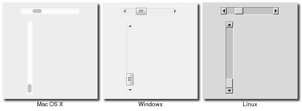
Scrollbar
A scrollbar helps the user to see all parts of another widget, whose content is typically
much larger than what can be shown in the available screen space.
Scrollbar Widgets
Scrollbars are created using the ttk::scrollbar command:
ttk::scrollbar .s -orient vertical -command ".l yview"
.l configure -yscrollcommand ".s set"
Scrollbars are created using the Tk::Tile::Scrollbar class:
s = Tk::Tile::Scrollbar.new(parent) {orient "vertical";
        command proc{|*args| l.yview(*args);} }
l['yscrollcommand'] = proc{|*args| s.set(*args);}
$s = $parent->new_ttk__scrollbar(-orient => 'vertical', -command => [$listbox, 'yview']);
$listbox->configure(-scrollcommand => [$s, 'set']);
Scrollbars are created using the ttk.Scrollbar command:
s = ttk.Scrollbar( parent, orient=VERTICAL, command=listbox.yview)
listbox.configure(yscrollcommand=s.set)
Unlike in some toolkits, scrollbars are not a part of another widget (e.g. a listbox), but are a separate widget altogether. Instead, scrollbars communicate with the scrolled widget by calling methods on the scrolled widget; as it turns out, the scrolled widget also needs to call methods on the scrollbar.
If you're using a recent Linux distribution, you've probably noticed that the scrollbars you see in many applications have changed to look more like what you'd see on Mac OS X. This newer look isn't supported yet in Tk.
The "orient" configuration option of scrollbars determines whether it will be used to scroll in the "horizontal" or "vertical". You then need to set up the "command" configuration option to communicate with the scrolled widget. This needs to be the method to call on the scrolled widget.
Every widget that can be scrolled vertically includes a method named "yview" (those that can be scrolled horizontally have a method named "xview"). As long as this method is present, the scrollbar doesn't need to know anything else about the scrolled widget. When the scrollbar is manipulated, it will tack on some number of parameters to the method call, indicating how it was scrolled, to what position, etc.
The scrolled widget also needs to communicate back to the scrollbar, telling it what percentage of the entire content area is now visible. Besides the yview and/or xview methods, every scrollable widget also has a "yscrollcommand" and/or "xscrollcommand" configuration option. This is used to specify a method call, which must be the scrollbar's "set" method. Again, additional parameters will be automatically tacked onto the method call.
Most scrollable widgets also have "xscrollbar" and "yscrollbar" methods that will save you the trouble of writing your own "command", "xscrollcommand", and "yscrollcommand" callbacks needed to wire a scrollable widget to a scrollbar. Instead you just do something like:
s = Tk::Tile::Scrollbar.new(parent) {orient "vertical"}
l.yscrollbar = s
If for some reason you want to move the scrollbar to a particular position from within your program, you can call the "set first last" method yourself. Pass it two values between 0 and 1 indicating the start and end percentage of the content area that is visible.
Example
Listboxes are one of several types of widgets that are scrollable. Here we'll build a very simple user interface, consisting just of a vertically scrollable listbox that takes up the entire window, with just a status line at the bottom.
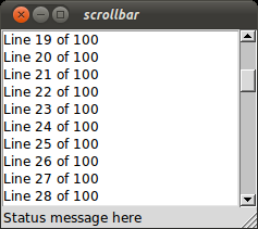
Scrolling a Listbox
grid [tk::listbox .l -yscrollcommand ".s set" -height 5] -column 0 -row 0 -sticky nwes
grid [ttk::scrollbar .s -command ".l yview" -orient vertical] -column 1 -row 0 -sticky ns
grid [ttk::label .stat -text "Status message here" -anchor w] -column 0 -row 1 -sticky we
grid [ttk::sizegrip .sz] -column 1 -row 1 -sticky se
grid columnconfigure . 0 -weight 1; grid rowconfigure . 0 -weight 1
for {set i 0} {$i<100} {incr i} {
   .l insert end "Line $i of 100"
}
require 'tk'
require 'tkextlib/tile'

root = TkRoot.new
$l = TkListbox.new(root) {height 5;
        yscrollcommand proc{|*args| $s.set(*args)} }.grid :column => 0, :row => 0, :sticky => 'nwes'
$s = Tk::Tile::Scrollbar.new(root) {orient 'vertical';
        command proc{|*args| $l.yview(*args)}}.grid :column => 1, :row => 0, :sticky => 'ns'
stat = Tk::Tile::Label.new(root) {text "Status message here";
        anchor 'w'}.grid :column => 0, :row => 1, :sticky => 'we'
sz = Tk::Tile::SizeGrip.new(root).grid :column => 1, :row => 1, :sticky => 'se'
TkGrid.columnconfigure root, 0, :weight => 1
TkGrid.rowconfigure root, 0, :weight => 1

(0..99).each {|i| $l.insert 'end', "Line #{i} of 100"}

Tk.mainloop
use Tkx;
my $mw = Tkx::widget->new(".");

($lb = $mw->new_tk__listbox(-height => 5))->g_grid(-column => 0, -row => 0, -sticky => "nwes");
($s = $mw->new_ttk__scrollbar(-command => [$lb, "yview"],
        -orient => "vertical"))->g_grid(-column =>1, -row => 0, -sticky => "ns");
$lb->configure(-yscrollcommand => [$s, "set"]);
($mw->new_ttk__label(-text => "Status message here",
        -anchor => "w"))->g_grid(-column => 0, -row => 1, -sticky => "we");
($mw->new_ttk__sizegrip)->g_grid(-column => 1, -row => 1, -sticky => "se");
$mw->g_grid_columnconfigure(0, -weight => 1); $mw->g_grid_rowconfigure(0, -weight => 1);
for ($i=0; $i<100; $i++) {
   $lb->insert("end", "Line " . $i . " of 100");
}

Tkx::MainLoop();
from tkinter import *
from tkinter import ttk

root = Tk()
l = Listbox(root, height=5)
l.grid(column=0, row=0, sticky=(N,W,E,S))
s = ttk.Scrollbar(root, orient=VERTICAL, command=l.yview)
s.grid(column=1, row=0, sticky=(N,S))
l['yscrollcommand'] = s.set
ttk.Sizegrip().grid(column=1, row=1, sticky=(S,E))
root.grid_columnconfigure(0, weight=1)
root.grid_rowconfigure(0, weight=1)
for i in range(1,101):
    l.insert('end', 'Line %d of 100' % i)
root.mainloop()
SizeGrip
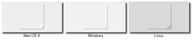
We actually snuck in one new widget in that last example, the sizegrip. This is the little box at the bottom right
corner of the window that allows you to resize it.
SizeGrip Widgets
SizeGrips are created using the ttk::sizegrip command:
grid [ttk::sizegrip .sz] -column 999 -row 999 -sticky se
SizeGrips are created using the Tk::Tile::SizeGrip class:
Tk::Tile::SizeGrip.new(parent).grid( :column => 999, :row => 999, :sticky => 'se')
SizeGrips are created using the new_ttk__sizegrip method, a.k.a. Tkx::ttk__sizegrip:
($parent->new_ttk__sizegrip)->g_grid(-column => 999, -row => 999, -sticky => "se")
SizeGrips are created using the ttk.Sizegrip function:
ttk.Sizegrip(parent).grid(column=999, row=999, sticky=(S,E))
While you'll notice that on some platforms (e.g. Mac OS X), Tk will automatically put the size grip there for you, it doesn't hurt to explicitly add it yourself. We'll discuss how to change the window size, determine if it's resizable, etc. in a later chapter.
Platform conventions tend to evolve faster than long-lived open source GUI toolkits. Mac OS X 10.7 did away with the size grip in the corner, in favour of allowing resizing from any window edge, finally catching up with the rest of the world. It's therefore best to check the operating system version you're running before adding the sizegrip.
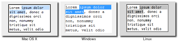
Text
A text widget provides users with an area so that they can enter multiple lines of text.
Text widgets are part of the classic Tk widgets, not the themed Tk widgets.
Text Widgets
Tk's text widget is, along with the canvas widget, one of two uber-powerful widgets that provide amazingly deep but easily programmed features. Text widgets have formed the basis for full word processors, outliners, web browsers and more. We'll get into some of the advanced stuff in a later chapter, but here we'll just show you what you need to use the text widget to capture fairly simple, multi-line text input.
Text widgets are created using the tk::text command:
tk::text .t -width 40 -height 10
Text widgets are created using the TkText class:
t = TkText.new(parent) {width 40; height 10}Text widgets are created using the new_tk__text method, a.k.a. Tkx::tk__text:
$parent->new_tk__text(-width => 40, -height => 10)
Text widgets are created using the Text function:
t = Text(parent, width=40, height=10)
The "width" and "height" options specify the requested screen size of the text widget, in characters and rows respectively. The contents of the text can be arbitrarily large. You can use the "wrap" configuration option to control how line wrapping is handled: values are "none" (no wrapping, text may horizontally scroll), "char" (wrap at any character), and "word" (wrapping will only occur at word boundaries).
A text widget can be disabled so that no editing can occur; because text is not a themed widget, the usual "state" and "instate" methods are not available. Instead, use the configuration option "state", setting it to either "disabled" or "normal".
Scrolling works the same way as in listboxes. The "xscrollcommand" and "yscrollcommand" configuration options are available to attach the text widget to horizontal and/or vertical scrollbars, and the "xview" and "yview" methods are available to be called from scrollbars. To ensure that a given line is visible (i.e. not scrolled out of view), you can use the "see index" method, where index is in the form "line number.character number", e.g. "5.0" for the first (0-based) character of line 5 (1-based).
Contents
Text widgets do not have a linked variable associated with them, like for example entry widgets do. To retrieve the text content for the entire widget, call the method "get 1.0 end"; the "1.0" is an index into the text, and means the first character of the first line, and "end" is a shortcut for the index of the last character, last line. Other indices could be passed to retrieve smaller ranges of text if needed.
Text can be added to the widget using the "insert index string" method; again index is in the form "line.char" and marks the character before which text is inserted; use "end" to add text to the end of the widget. You can delete a range of text using the "delete start end" method, where both start and end are text indices as already described.
We'll get into the text widget's many additional advanced features in a later chapter.
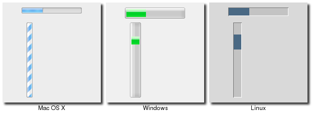
Progressbar
A progressbar widget provides a way to give feedback to the user about the progress of a lengthy operation. This may be done either as a percentage complete display for operations where this can be estimated, or a display that changes to indicate the operation is continuing, but without an estimate of completion.
Progressbar Widgets
Progessbar widgets are created using the ttk::progressbar command:
ttk::progressbar .p -orient horizontal -length 200 -mode determinate
Progessbar widgets are created using the Tk::Tile::Progessbar class:
p = Tk::Tile::Progressbar.new(parent) {orient 'horizontal'; length 200; mode 'determinate'}Progressbar widgets are created using the new_ttk__progressbar method, a.k.a. Tkx::ttk__progressbar:
$parent->new_ttk__progressbar(-orient => 'horizontal', -length => 200, -mode => 'determinate')
Progessbar widgets are created using the ttk.Progessbar class:
p = ttk.Progressbar(parent, orient=HORIZONTAL, length=200, mode='determinate')
The "orient" option may be either "horizontal" or "vertical". The "length" option, which represents the longer axis of either horizontal or vertical progressbars, is specified in screen units (e.g. pixels). The "mode" configuration option can be set to either "determinate", where the progressbar will indicate relative progress towards completion, or to "indeterminate", where its not possible to know how far along in the task the program is, but we still want to provide feedback that things are still running.
Determinate Progess
In determinate mode, you're able to provide more-or-less accurate feedback to the user about how far an operation has progressed. To do this, you need to first of all tell the progressbar how many "steps" the operation will take, and then as you go along, tell the progressbar how far along the operation is.
You can provide the total number of steps to the progressbar using the "maximum" configuration option; this is a floating point number that defaults to 100 (i.e. each step is 1%). To tell the progressbar how far along you are in the operation, you will repeatedly change the "value" configuration option. So this would start at 0, and then count upwards to the maximum value you have set. There are two slight variations on this. First, you can just store the current value for the progressbar in a variable linked to it by the progressbar's "variable" configuration option; that way, when you change the variable, the progressbar will update. The other alternative is to call the progressbar's "step ?amount?" method to increment the value by the given "amount" (defaults to 1.0).
Indeterminate Progress
Indeterminate mode is for when you're not able to easily know (or estimate) how far along in a long running task you actually are, but still want to provide feedback to the user that the operation is still running (or that your program hasn't crashed). Rather than providing specific values to indicate progress along the way, at the start of the operation you'll just call the progressbar's "start" method, and at the end of the operation, you'll call its "stop" method. The progressbar will take care of the rest.
Scale
A scale widget provides a way for users to choose a numeric value through direct manipulation.
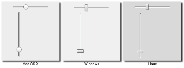
Scale Widgets
Scale widgets are created using the ttk::scale command:
ttk::scale .s -orient horizontal -length 200 -from 1.0 -to 100.0
Scale widgets are created using the Tk::Tile::Scale class:
s = Tk::Tile::Scale.new(parent) {orient 'horizontal'; length 200; from 1.0; to 100.0}Scale widgets are created using the new_ttk__scale method, a.k.a. Tkx::ttk__scale:
$parent->new_ttk__scale(-orient => 'horizontal', -length => 200, -from => 1.0, -to => 100.0)
Scale widgets are created using the ttk.Scale function:
s = ttk.Scale(parent, orient=HORIZONTAL, length=200, from_=1.0, to=100.0)
Because 'from' is a reserved keyword, you'll need to add a trailing underscore when using it as a configuration option.
In some ways, scale widgets are like progressbars, except they are designed for the user to manipulate them. As with progressbars, they should be given an orientation (horizontal or vertical) with the "orient" configuration option, and an optional "length". You should also define the range of the number that the scale allows users to choose; to do this, set a floating point number for each of the "from" and "to" configuration options.
There are several different ways you can set the current value of the scale (which must be a floating point value between the "from" and "to" values). You can set (or read, to get the current value) the scale's "value" configuration option. You can link the scale to a variable using the "variable" option. Or, you can call the scale's "set value" method to change the value, or the "get" method to read the current value.
There is a "command" configuration option, which lets you specify a script to call whenever the scale is changed. Tk will automatically append the current value of the scale as a parameter each time it invokes this script (we saw a similar thing with extra parameters being added to scrollbar callbacks and those on the widgets they scroll).
As with other themed widgets, you can use the "state disabled", "state !disabled" and "instate disabled" methods if you wish to prevent the user from modifying the scale.
As the scale widget does not display the actual values, you may want to add those as labels.
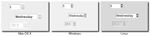
Spinbox
A spinbox widget allows users to choose numbers (or in fact, items from an arbitrary list). It does this by combining an entry-like widget showing the current value with a pair of small up/down arrows which can be used to step through the range of possible choices.
Spinboxes are part of the classic Tk widgets. There is not presently a spinbox in the themed Tk widget set.
That last statement is not entirely accurate. A themed spinbox widget was in fact added in Tk 8.5.9. So if your code just assumes 8.5 (as this tutorial does), you can't rely on it. It may be worth checking to see if you're running 8.5.9 or higher, and if so, use the themed version. But as with other themed widgets, the API is slightly different than the classic widget.
Spinbox Widgets
Spinbox widgets are created using the tk::spinbox command:
tk::spinbox .s -from 1.0 -to 100.0 -textvariable spinval
Spinbox widgets are created using the Tk_Spinbox class:
$spinval = TkVariable.new
s = TkSpinbox.new(parent) {from 1.0; to 100.0; textvariable $spinval}
Spinbox widgets are created using the new_ttk__spinbox method, a.k.a. Tkx::ttk__spinbox:
$parent->new_tk__spinbox(-from => 1.0, -to => 100.0, -textvariable => \$spinval)
Spinbox widgets are created using the Spinbox function:
spinval = StringVar()
s = Spinbox(parent, from_=1.0, to=100.0, textvariable=spinval)
Like scale widgets, spinboxes are normally used to let the user choose a number between a certain range (specified using the "from" and "to" configuration options), though through a very different user interface. You can also specify a "increment", which controls how much the value changes everytime you click the up or down button.
Like a listbox or combobox, spinboxes can also be used to let the user choose an item from an arbitrary list of strings; these can be specified using the "values" configuration option, which works in the same was as in comboboxes. Specifying a list of values will override to "from" and "to" settings.
You might be puzzled about when to choose a scale, listbox, combobox, entry or a spinbox, since usually several of
these can be used for the same types of data. The answer really depends on the type of data you want the user to
select, platform user interface conventions, and the role the value plays in your user interface.
For example, both a combobox and a spinbox have the benefit of taking up fairly small amounts of space, which might make sense
for a more peripheral setting, where the primary choice in a user interface may warrant the extra space a listbox
occupies. Spinboxes don't make much sense when items don't have a natural and obvious ordering to them. You should be
careful about both comboboxes and spinboxes that have too many items in them, which can make it more time consuming to
select an item.
Both both a numeric and arbitrary range, there is a "wrap" option which accepts a boolean, and determines whether the value should wrap around when it goes beyond the starting or ending values. You can also specify a "width" for the entry holding the current value of the spinbox.
Again there are choices as to how to set or get the current value in the spinbox. Normally, you would specify a linked variable with the "textvariable" configuration option; as usual, any changes to the variable are reflected in the spinbox, while any changes in the spinbox are reflected in the linked variable. As well, the "set value" and "get" methods allow you to set or get the value directly.
You can arranged to be called whenever the spinbox changes using the "command" configuration option.
The command has a couple of percent substitutions, %s = current value, and %d = up or down. Need to figure out the right way to specify this in Ruby. Also need to add stuff about validation.
Because spinbox is not a themed widget, the "state" and "instate" methods are not available. Instead, you can change its state using the "state" configuration option. This may be "normal", "disabled" to prevent any changes.