
 If you've found the material on this site useful, please consider purchasing this
e-book (only $10), which is based on the Python material in the tutorial. Doing so helps me
maintain and update this site. Thank you very much!
If you've found the material on this site useful, please consider purchasing this
e-book (only $10), which is based on the Python material in the tutorial. Doing so helps me
maintain and update this site. Thank you very much!
@markroseman
mark@markroseman.com
 Buy now for your Kindle
 Buy the DRM-free PDF
Essentials
- Tk Backgrounder
- Installing Tk
- Tutorial
- Widget Roundup
- Languages Using Tk
- Official Tk Command Reference
(Tcl-oriented; at www.tcl.tk)
Tutorial
Basic Widgets
This chapter introduces you to the basic Tk widgets that you'll find in just about any user interface: frames, labels, buttons, checkbuttons, radiobuttons, entries and comboboxes. By the end, you'll know how to use all the widgets you'd ever need for a typical fill-in form type of user interface.
This chapter (and those following that discuss more widgets) are meant to be read in order. Because there is so much commonality between many widgets, we'll introduce certain concepts in an earlier widget that will also apply to a later one. Rather than going over the same ground multiple times, we'll just refer back to when the concept was first introduced.
At the same time, each widget will also refer to the widget roundup page for the specific widget, as well as the reference manual page, so feel free to jump around a bit too.
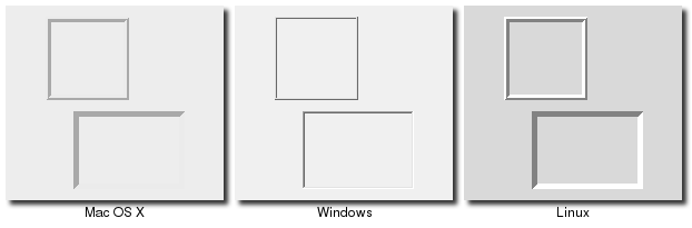
Frame
A frame is a widget that displays just as a simple rectangle. Frames are primarily used as a container for other widgets, which are under the control of a geometry manager such as grid.
Frame Widgets
Frames are created using the ttk::frame command:
ttk::frame .frame
Frames are created using the Tk::Tile::Frame class:
frame = Tk::Tile::Frame.new(parent)
Frames are created using the new_ttk__frame method, a.k.a. Tkx::ttk__frame():
$frame = $parent->new_ttk__frame;
Frames are created using the ttk.Frame function:
frame = ttk.Frame(parent)
Frames can take several different configuration options which can alter how they are displayed.
Requested Size
Like any other widget, after creation it is added to the user interface via a (parent) geometry manager. Normally, the size that the frame will request from the geometry manager will be determined by the size and layout of any widgets that are contained in it (which are under the control of the geometry manager that manages the contents of the frame itself).
If for some reason you want an empty frame that does not contain other widgets, you should instead explicitly set the size that the frame will request from its parent geometry manager using the "width" and/or "height" configuration options (otherwise you'll end up with a very small frame indeed).
Normally, distances such as width and height are specified just as a number of pixels on the screen. You can also specify them via one of a number of suffixes. For example, "350" means 350 pixels, "350c" means 350 centimeters, "350i" means 350 inches, and "350p" means 350 printer's points (1/72 inch).
Padding
The "padding" configuration option is used to request extra space around the inside of the widget; this way if you're putting other widgets inside the frame, there will be a bit of a margin all the way around. A single number specifies the same padding all the way around, a list of two numbers lets you specify the horizontal then the vertical padding, and a list of four numbers lets you specify the left, top, right and bottom padding, in that order.
.frame configure -padding "5 10"
frame['padding'] = '5 10'
$frame->configure(-padding => "5 10")
frame['padding'] = (5,10)
Borders
You can display a border around the frame widget; you see this a lot where you might have a part of the user interface looking "sunken" or "raised" in relation to its surroundings. To do this, you need to set the "borderwidth" configuration option (which defaults to 0, so no border), as well as the "relief" option, which specifies the visual appearance of the border: "flat" (default), "raised", "sunken", "solid", "ridge", or "groove".
.frame configure -borderwidth 2 -relief sunken
frame['borderwidth'] = 2
frame['relief'] = 'sunken'
$frame->configure(-borderwidth => 2, -relief => "sunken")
frame['borderwidth'] = 2
frame['relief'] = 'sunken'
Changing Styles
There is also a "style" configuration option, which is common to all of the themed widgets, which can let you control just about any aspect of their appearance or behavior. This is a bit more advanced, so we won't go into it right now.
Styles mark a sharp departure from the way most aspects of a widget's visual appearance are changed
in the "classic" Tk widgets. While in classic Tk you could provide a wide range of options to finely
control every aspect of behavior (foreground color, background color, font, highlight thickness,
selected foreground color, padding, etc.), in the new themed widgets these changes are done by changing styles,
not adding options to each widget.
As such, many of the options
you may be familiar with in certain widgets are not present in their themed version. Given that
overuse of such options was a key factor undermining the appearance of Tk applications, especially when
moved across platforms, transitioning to themed widgets provides an opportune time to review and
refine if and how such appearance changes are made.
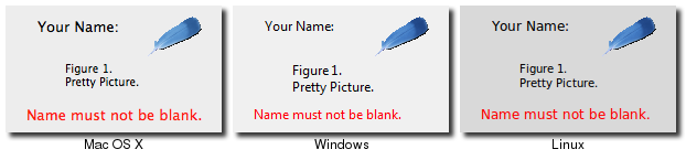
Label
A label is a widget that displays text or images, typically that the user will just view but not otherwise interact with. Labels are used for such things as identifying controls or other parts of the user interface, providing textual feedback or results, etc.
Label Widgets
Labels are created using the ttk::label command, and typically their contents are set up at the same time:
ttk::label .label -text {Full name:}Labels are created using the Tk::Tile::Label class, and typically their contents are set up at the same time:
label = Tk::Tile::Label.new(parent) {text 'Full name:'}Labels are created using the new_ttk__label method, a.k.a. Tkx::ttk__label(), and typically their contents are set up at the same time:
$label = $parent->new_ttk__label(-text => "Full name:");
Labels are created using the ttk.Label function, and typically their contents are set up at the same time:
label = ttk.Label(parent, text='Full name:')
Like frames, labels can take several different configuration options which can alter how they are displayed.
Displaying Text
The "text" configuration option shown above when creating the label is the most commonly used, particularly when the label is purely decorative or explanatory. You can of course change this option at any time, not only when first creating the label.
You can also have the widget monitor a variable in your script, so that anytime the variable changes, the label will display the new value of the variable; this is done with the "textvariable" option:
.label configure -textvariable resultContents
set resultContents "New value to display"
Variables must be global, or the fully qualified name given for those within a namespace.
$resultsVar = TkVariable.new
label['textvariable'] = $resultsVar
$resultsVar.value = 'New value to display'
Ruby's Tk binding only allows you to attach to an instance of the "TkVariable" class, which contains all the logic to watch for changes, communicate them back and forth between the variable and Tk, and so on. You need to read or write the current value using the "value" accessor, as shown.
$label->configure(-textvariable => \$resultContents);
$resultContents = "New value to display";
resultsContents = StringVar()
label['textvariable'] = resultsContents
resultsContents.set('New value to display')
Tkinter only allows you to attach to an instance of the "StringVar" class, which contains all the logic to watch for changes, communicate them back and forth between the variable and Tk, and so on. You need to read or write the current value using the "get" and "set" methods.
Displaying Images
You can also display an image in a label instead of text; if you just want an image sitting in your interface, this is normally the way to do it. We'll go into images in more detail in a later chapter, but for now, let's assume you want to display a GIF image that is sitting in a file on disk. This is a two-step process, first creating an image "object", and then telling the label to use that object via its "image" configuration option:
image create photo imgobj -file "myimage.gif"
.label configure -image imgobj
image = TkPhotoImage.new(:file => "myimage.gif")
label['image'] = image
Tkx::image_create_photo( "imgobj", -file => "myimage.gif");
$label->configure(-image => "imgobj");
image = PhotoImage(file='myimage.gif')
label['image'] = image
You can use both an image and text, as you'll often see in toolbar buttons, via the "compound" configuration option. The default value is "none", meaning display only the image if present, otherwise the text specified by the "text" or "textvariable" options. Other options are "text" (text only), "image" (image only), "center" (text in center of image), "top" (image above text), "left", "bottom", and "right".
Layout
While the overall layout of the label (i.e. where it is positioned within the user interface, and how large it is) is determined by the geometry manager, there are several options that can help you control how the label will be displayed within the box the geometry manager gives it.
If the box given to the label is larger than the label requires for its contents, you can use the "anchor" option to specify what edge or corner the label should be attached to, which would leave any empty space in the opposite edge or corner. Possible values are specified as compass directions: "n" (north, or top edge), "ne", (north-east, or top right corner), "e", "se", "s", "sw", "w", "nw" or "center".
Labels can be used to display more than one line of text. This can be done by embedding carriage returns ("\n") in the "text"/"textvariable" string. You can also let the label wrap the string into multiple lines that are no longer than a given length (with the size specified as pixels, centimeters, etc.), by using the "wraplength" option.
Multi-line labels are a replacement for the older "message" widgets in classic Tk.
You can also control how the text is justified, by using the "justify" option, which can have the values "left", "center" or "right". If you only have a single line of text, this is pretty much the same as just using the "anchor" option, but is more useful with multiple lines of text.
Fonts, Colors and More
Like with frames, normally you don't want to touch things like the font and colors directly, but if you need to change them (e.g. to create a special type of label), this would be done via creating a new style, which is then used by the widget with the "style" option.
Unliked most themed widgets, the label widget also provides explicit widget-specific options as an alternative; again, you'd use this only in special one-off cases, when using a style didn't necessarily make sense.
You can specify the font used to display the label's text using the "font" configuration option. While we'll go into fonts in more detail in a later chapter, here are the names of some predefined fonts you can use:
| TkDefaultFont | The default for all GUI items not otherwise specified. |
| TkTextFont | Used for entry widgets, listboxes, etc. |
| TkFixedFont | A standard fixed-width font. |
| TkMenuFont | The font used for menu items. |
| TkHeadingFont | The font typically used for column headings in lists and tables. |
| TkCaptionFont | A font for window and dialog caption bars. |
| TkSmallCaptionFont | A smaller caption font for subwindows or tool dialogs |
| TkIconFont | A font for icon captions. |
| TkTooltipFont | A font for tooltips. |
Because the choice of fonts is so platform specific, be careful of hardcoding them (font families, sizes, etc.); this is something else you'll see in a lot of older Tk programs that can make them look ugly.
The foreground (text) and background color can also be changed via the "foreground" and "background" options. Colors are covered in detail later, but you can specify these as either color names (e.g. "red") or hex RGB codes (e.g. "#ff340a").
Labels also accept the "relief" option that was discussed for frames.
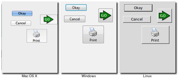
Button
A button, unlike a frame or label, is very much designed for the user to interact with, and in particular, press to perform some action. Like labels, they can display text or images, but also have a whole range of new options used to control their behavior.
Button Widgets
Buttons are created using the ttk::button command, and typically their contents and command callback are set up at the same time:
ttk::button .button -text "Okay" -command "submitForm"
Buttons are created using the Tk::Tile::Button class, and typically their contents and command callback are set up at the same time:
button = Tk::Tile::Button.new(parent) {text 'Okay'; command 'submitForm'}Buttons are created using the new_ttk__button method, a.k.a. Tkx::ttk__button(), and typically their contents and command callbackare set up at the same time:
$button = $parent->new_ttk__button(-text => "Okay", -command => sub {submitForm();});Buttons are created using the ttk.Button function, and typically their contents and command callback are set up at the same time:
button = ttk.Button(parent, text='Okay', command=submitForm)
As with other widgets, buttons can take several different configuration options which can alter their appearance and behavior.
Text or Image
Buttons take the same "text", "textvariable" (rarely used), "image" and "compound" configuration options as labels, which control whether the button displays text and/or an image.
Buttons have a "default" option, which tells Tk that the button is the default button in the user interface (i.e. the one that will be invoked if the user hits Enter or Return). Some platforms and styles will draw this with a different border or highlight. Set the option to "active" to specify this is a default button; the regular state is "normal". Note that setting this option doesn't create an event binding that will make the Return or Enter key activate the button; that you have to do yourself.
The Command Callback
The "command" option is used to provide an interface between the button's action and your application. When the user clicks the button, the script provided by the option is evaluated by the interpreter.
You can also ask the button to invoke the command callback from your application. This is useful so that you don't need to repeat the command to be invoked several times in your program; so you know if you change the option on the button, you don't need to change it elsewhere too.
.button invoke
button invoke
$button->invoke
button.invoke()
Button State
Buttons and many other widgets can be in a normal state where they can be pressed, but can also be put into a disabled state, where the button is greyed out and cannot be pressed. This is done when the button's command is not applicable at a given point in time.
All themed widgets carry with them an internal state, which is a series of binary flags. You can set or clear these different flags, as well as check the current setting using the "state" and "instate" methods. Buttons make use of the "disabled" flag to control whether or not the user can press the button. For example:
.button state disabled            ;# set the disabled flag, disabling the button
.button state !disabled           ;# clear the disabled flag
.button instate disabled          ;# return 1 if the button is disabled, else 0
.button instate !disabled         ;# return 1 if the button is not disabled, else 0
.button instate !disabled {mycmd} ;# execute 'mycmd' if the button is not disabled
button.state('disabled')            ;# set the disabled flag, disabling the button
button.state('!disabled')           ;# clear the disabled flag
button.instate('disabled')          ;# return true if the button is disabled, else false
button.instate('!disabled')         ;# return true if the button is not disabled, else false
button.instate('!disabled', 'cmd')  ;# execute 'cmd' if the button is not disabled
$button->state("disabled")                  ;# set the disabled flag, disabling the button
$button->state("!disabled")                 ;# clear the disabled flag
$button->instate("disabled")                ;# return 1 if the button is disabled, else 0
$button->instate("!disabled")               ;# return 1 if the button is not disabled, else 0
$button->instate("!disabled", sub {mycmd})  ;# execute 'mycmd' if the button is not disabled
button.state(['disabled'])            # set the disabled flag, disabling the button
button.state(['!disabled'])           # clear the disabled flag
button.instate(['disabled'])          # return true if the button is disabled, else false
button.instate(['!disabled'])         # return true if the button is not disabled, else false
button.instate(['!disabled'], cmd)    # execute 'cmd' if the button is not disabled
Note that these commands accept an array of state flags as their argument.
Using "state"/"instate" replaces the older "state" configuration option (which took the values "normal" or "disabled"). This configuration option is actually still available in Tk 8.5, but "write-only", which means that changing the option calls the appropriate "state" command, but other changes made using the "state" command are not reflected in the option. This is only for compatibility reasons; you should change your code to use the new state vector.
The full list of state flags available to themed widgets is: "active", "disabled", "focus", "pressed", "selected", "background", "readonly", "alternate", and "invalid". These are described in the themed widget reference; not all states are meaningful for all widgets. It's also possible to get fancy in the "state" and "instate" methods and specify multiple state flags at the same time.
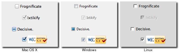
Checkbutton
A checkbutton is like a regular button, except that not only can the user press it, which will invoke a command callback, but it also holds a binary value of some kind (i.e. a toggle). Checkbuttons are used all the time when a user is asked to choose between e.g. two different values for an option.
Checkbutton Widgets
Checkbuttons are created using the ttk::checkbutton command, and typically set up at the same time:
ttk::checkbutton .check -text "Use Metric" -command "metricChanged"
	    -variable measuresystem -onvalue metric -offvalue imperial
Checkbuttons are created using the Tk::Tile::CheckButton class, and typically set up at the same time:
$measureSystem = TkVariable.new
check = Tk::Tile::CheckButton.new(parent) {text 'Use Metric';
	    command 'metricChanged'; variable $measureSystem;
	    onvalue 'metric'; offvalue 'imperial'}
Checkbuttons are created using the new_ttk__checkbutton method, a.k.a. Tkx::ttk__checkbutton, and typically set up at the same time:
$check = $parent->new_ttk__checkbutton(-text => "Use Metric", -command => sub {metricChanged},
	    -variable => \$measuresystem, -onvalue => "metric", -offvalue => "imperial")
Checkbuttons are created using the ttk.Checkbutton function, and typically set up at the same time:
measureSystem = StringVar()
check = ttk.Checkbutton(parent, text='Use Metric',
	    command=metricChanged, variable=measureSystem,
	    onvalue='metric', offvalue='imperial')
Checkbuttons use many of the same options as regular buttons, but add a few more. The "text", "textvariable", "image", and "compound" options control the display of the label (next to the check box itself), and the "state" and "instate" methods allow you to manipulate the "disabled" state flag to enable or disable the checkbutton. Similarly, the "command" option lets you specify a script to be called everytime the user toggles the checkbutton, and the "invoke" method will also execute the same callback.
Widget Value
Unlike buttons, checkbuttons also hold a value. We've seen before how the "textvariable" option can be used to tie the label of a widget to a variable in your program; the "variable" option for checkbuttons behaves similarly, except it is used to read or change the current value of the widget, and updates whenever the widget is toggled. By default, checkbuttons use a value of "1" when the widget is checked, and "0" when not checked, but these can be changed to just about anything using the "onvalue" and "offvalue" options.
What happens when the linked variable contains neither the on value or the off value (or even doesn't exist)? In that case, the checkbutton is put into a special "tristate" or indeterminate mode; you'll sometimes see this in user interfaces where the checkbox holds a single dash rather than being empty or holding a check mark. When in this state, the state flag "alternate" is set, so you can check for it with the "instate" method:
.check instate alternate
check.instate('alternate')$check->instate("alternate")check.instate(['alternate'])
Because the checkbutton won't automatically set (or create) the linked variable, your program needs to make sure it sets the variable to the appropriate starting value.
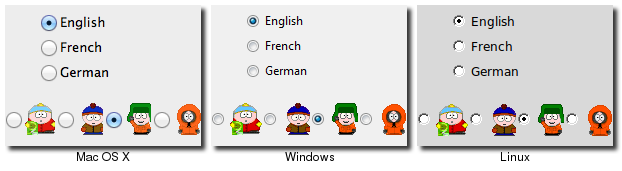
Radiobutton
A radiobutton lets you choose between one of a number of mutually exclusive choices; unlike a checkbutton, it is not limited to just two choices. Radiobuttons are always used together in a set, and are a good option when the number of choices is fairly small, e.g. 3-5.
Radiobutton Widgets
Radiobuttons are created using the ttk::radiobutton command, typically as a set:
ttk::radiobutton .home -text "Home" -variable phone -value home
ttk::radiobutton .office -text "Office" -variable phone -value office
ttk::radiobutton .cell -text "Mobile" -variable phone -value cell
Radiobuttons are created using the Tk::Tile::RadioButton class, and typically as a set:
$phone = TkVariable.new
home = Tk::Tile::RadioButton.new(parent) {text 'Home'; variable $phone; value 'home'}
office = Tk::Tile::RadioButton.new(parent) {text 'Office'; variable $phone; value 'office'}
cell = Tk::Tile::RadioButton.new(parent) {text 'Mobile'; variable $phone; value 'cell'}
Radiobuttons are created using the new_ttk__radiobutton method, a.k.a. Tkx::ttk__radiobutton, typically as a set:
$home = $parent->new_ttk__radiobutton(-text => "Home", -variable => \$phone, -value => "home");
$office = $parent->new_ttk__radiobutton(-text => "Office", -variable => \$phone, -value => "office");
$cell = $parent->new_ttk__radiobutton(-text => "Mobile", -variable => \$phone, -value => "cell");
Radiobuttons are created using the ttk.Radiobutton function, and typically as a set:
phone = StringVar()
home = ttk.Radiobutton(parent, text='Home', variable=phone, value='home')
office = ttk.Radiobutton(parent, text='Office', variable=phone, value='office')
cell = ttk.Radiobutton(parent, text='Mobile', variable=phone, value='cell')
Radiobuttons share most of the same configuration options as checkbuttons. One exception is that the "onvalue" and "offvalue" options are replaced with a single "value" option. Each of the radiobuttons of the set will have the same linked variable, but a different value; when the variable has the given value, the radiobutton will be selected, otherwise unselected. When the linked variable does not exist, radiobuttons also display a "tristate" or indeterminate, which can be checked via the "alternate" state flag.
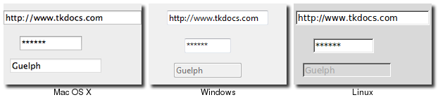
Entry
An entry presents the user with a single line text field that they can use to type in a string value. These can be just about anything: their name, a city, a password, social security number, and so on.
Entry Widgets
Entries are created using the ttk::entry command:
ttk::entry .name -textvariable username
Entries are created using the Tk::Tile::Entry class:
$username = TkVariable.new
name = Tk::Tile::Entry.new(parent) { textvariable $username }
Entries are created using the new_ttk__entry method, a.k.a. Tkx::ttk__entry:
$name = $parent->new_ttk__entry(-textvariable => \$username)
Entries are created using the ttk.Entry function:
username = StringVar()
name = ttk.Entry(parent, textvariable=username)
A "width" configuration option may be specified to provide the number of characters wide the entry should be, allowing you for example to provide a shorter entry for a zip or postal code.
We've seen how checkbutton and radiobutton widgets have a value associated with them. Entries do as well, and that value is normally accessed through a linked variable specified by the "textvariable" configuration option. Note that unlike the various buttons, entries don't have a separate text or image beside them to identify them; use a separate label widget for that.
You can also get or change the value of the entry widget directly, without going through the linked variable. The "get" method returns the current value, and the "delete" and "insert" methods let you change the contents, e.g.
puts "current value is [.name get]"
.name delete 0 end           ; # delete between two indices, 0-based
.name insert 0 "your name"   ; # insert new text at a given index
puts ("current value is #{name.get}")
name.delete(0, end)          ; # delete between two indices, 0-based
name.insert(0, 'your name')  ; # insert new text at a given index
print "current value is " . $name->get $name->delete(0, "end") ; # delete between two indices, 0-based $name->insert(0, "your name") ; # insert new text at a given index
print('current value is %s' % name.get())
name.delete(0,'end')          # delete between two indices, 0-based
name.insert(0, 'your name')   # insert new text at a given index
Note that entry widgets do not have a "command" option which will invoke a callback whenever the entry is changed. To watch for changes, you should watch for changes on the linked variable. See also "Validation", below.
Passwords
Entries can be used for passwords, where the actual contents are displayed as a bullet or other symbol. To do this, set the "show" configuration option to the character you'd like to display, e.g. "*".
Widget States
Like the various buttons, entries can also be put into a disabled state via the "state" command (and queried with "instate"). Entries can also use the state flag "readonly"; if set, users cannot change the entry, though they can still select the text in it (and copy it to the clipboard). There is also an "invalid" state, set if the entry widget fails validation, which leads us to...
Validation
validate (controls overall validation behavior) - none (default), key (on each keystroke, runs before - prevalidation), focus/focusin/focusout (runs after.. revalidation), all
* validatecommand script (script must return 1 or 0)
* invalidcommand script (runs when validate command returns 0)
- various substitutions in scripts.. most useful %P (new value of entry), %s (value of entry prior to editing)
- the callbacks can also modify the entry using insert/delete, or modify -textvariable, which means the
in progress edit is rejected in any case (since it would overwrite what we just set)
* .e validate to force validation now
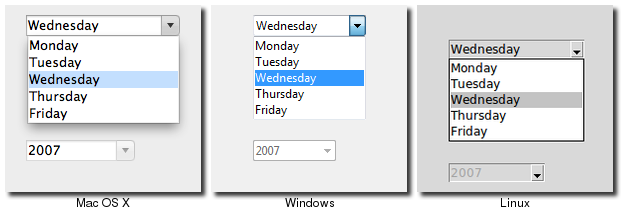
Combobox
A combobox combines an entry with a list of choices available to the user. This lets them either choose from a set of values you've provided (e.g. typical settings), but also put in their own value (e.g. for less common cases you don't want to include in the list).
Combobox Widgets
Comboboxes are created using the ttk::combobox command:
ttk::combobox .country -textvariable country
Comboboxes are created using the Tk::Tile::Combobox class:
$countryvar = TkVariable.new
country = Tk::Tile::Combobox.new(parent) { textvariable $countryvar }
Comboboxes are created using the new_ttk__combobox method, a.k.a. Tkx::ttk__combobox:
$country = $parent->new_ttk__combobox(-textvariable => \$countryvar)
Comboboxes are created using the ttk.Combobox function:
countryvar = StringVar()
country = ttk.Combobox(parent, textvariable=countryvar)
Like entries, the "textvariable" option links a variable in your program to the current value of the combobox. As with other widgets, you should initialize the linked variable in your own code. You can also get the current value using the "get" method, and change the current value using the "set" method (which takes a single argument, the new value).
A combobox will generate a "<ComboboxSelected>" virtual event that you can bind to whenever its value changes.
bind .country <<ComboboxSelected>> { script }country.bind("<ComboboxSelected>") { script }$country->g_bind("<<ComboboxSelected>>", sub { script })country.bind('<<ComboboxSelected>>', function)Predefined Values
You can provide a list of values the user can choose from using the "values" configuration option:
.country configure -values [list USA Canada Australia]
country['values'] = [ 'USA', 'Canada', 'Australia']
$country->configure(-values => "USA Canada Australia")
country['values'] = ('USA', 'Canada', 'Australia')If set, the "readonly" state flag will restrict the user to making choices only from the list of predefined values, but not be able to enter their own (though if the current value of the combobox is not in the list, it won't be changed).
If you're using the combobox in "readonly" mode, I'd recommend that when the value changes (i.e. on a ComboboxSelected event), that you call the "selection clear" method. It looks a bit odd visually without doing that.
As a complement to the "get" and "set" methods, you can also use the "current" method to determine which item in the predefined values list is selected (call "current" with no arguments, it will return a 0-based index into the list, or -1 if the current value is not in the list), or select one of the items in the list (call "current" with a single 0-based index argument).
Want to associate some other value with each item in the list, so that your program can refer to some actual meaningful value, but it gets displayed in the combobox as something else? You'll want to have a look at the section entitled "Keeping Extra Item Data" when we get to the discussion of listboxes in a couple of chapters from now.